
In this article, we will explore how to create stacked bar charts using the Matplotlib library in Python. We will start with the basics and gradually move towards more advanced customization options, using NumPy to generate sample data for our charts.
Introduction to Stacked Bar Charts in Matplotlib
Stacked bar charts are a popular visualization tool used to represent categorical data. They provide a way to compare multiple categories within each bar, showcasing the composition and distribution of different elements. Stacked bar charts are particularly useful when analyzing data that can be divided into distinct categories or groups, and they allow for easy identification of both individual and cumulative contributions.
Stacked bar charts are effective in various scenarios, such as:
- Comparing the distribution of a categorical variable across different groups or time periods.
- Visualizing the composition of a whole, broken down into various subcategories.
- Analyzing the contribution of different factors to an overall outcome.
How to create Stacked Bar Charts
To begin, we need to import the necessary libraries, including Matplotlib and NumPy. Matplotlib provides the tools for creating visualizations, while NumPy helps generate sample data for our stacked bar charts. Let’s import the required libraries:
import matplotlib.pyplot as plt
import numpy as np
Now that we have the libraries in place, let’s proceed with the creation of a basic stacked bar chart.
Step 1: Setting up the Data
We will generate random sample data using NumPy to populate our stacked bar chart. Let’s assume we have three categories (A, B, and C) and five groups (Group 1, Group 2, Group 3, Group 4, and Group 5). We’ll create a NumPy array with random values representing the contribution of each category to each group:
categories = ['A', 'B', 'C']
groups = ['Group 1','Group 2','Group 3','Group 4','Group 5']

data = np.random.rand(len(groups), len(categories))
In this example, we use the rand() function from NumPy to generate random values between 0 and 1 for each element in the data array. You can replace this with your own data or calculations based on your specific use case.
Step 2: Setting up the Figure and Axes
The next step is to set up the figure and axes objects using Matplotlib. The figure represents the entire visual space, while the axes represent the individual plotting area within the figure.
fig, ax = plt.subplots()
Here, we use the subplots() function from Matplotlib to create a new figure and assign it to the fig variable. The ax variable represents the axes object within the figure.
Step 3: Plotting the Stacked Bar Chart
With the figure and axes in place, we can proceed to plot the stacked bar chart using the bar() function from Matplotlib.
for i in range(len(categories)):
    ax.bar(groups,
           data[:, i],
           bottom=np.sum(data[:, :i], axis=1),
           label=categories[i])
In this code snippet, we use a loop to plot the stacked bars for each category. The bar() function is called for each category, and we provide the bottom parameter to specify the cumulative contribution of the preceding categories using NumPy’s sum() function. The label parameter helps identify each category in the legend.
Step 4: Customizing the Chart Appearance
We can customize various aspects of the chart, such as colors, labels, title, and legend. Here’s an example of some common customizations:
ax.set_xlabel('Groups')
ax.set_ylabel('Values')
ax.set_title('Stacked Bar Chart')
ax.legend()
In this snippet, we use the set_xlabel(), set_ylabel(), and set_title() functions to set the labels and title of the chart. The legend() function automatically generates a legend based on the labels provided during the plotting step.
Step 5: Displaying the Chart
Finally, we can display the chart using plt.show():
plt.show()
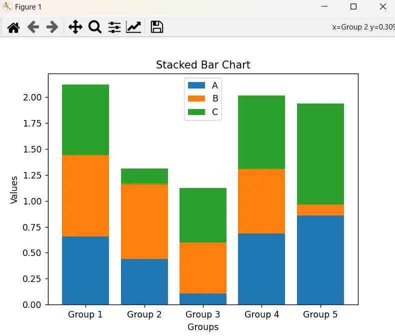
Let’s put all the steps together to create a basic stacked bar chart:
import matplotlib.pyplot as plt
import numpy as np

# Step 1: Setting up the Data
categories = ['A', 'B', 'C']
groups = ['Group 1', 'Group 2', 'Group 3', 'Group 4', 'Group 5']
data = np.random.rand(len(groups), len(categories))

# Step 2: Setting up the Figure and Axes
fig, ax = plt.subplots()

# Step 3: Plotting the Stacked Bar Chart
for i in range(len(categories)):
    ax.bar(groups,
           data[:, i],
           bottom=np.sum(data[:, :i], axis=1),
           label=categories[i])

# Step 4: Customizing the Chart Appearance
ax.set_xlabel('Groups')
ax.set_ylabel('Values')
ax.set_title('Stacked Bar Chart')
ax.legend()

# Step 5: Displaying the Chart
plt.show()
When you run this code, you will see a basic stacked bar chart with random values generated using NumPy.
Customization Options
Matplotlib provides a range of advanced customization options for stacked bar charts, allowing you to tailor the appearance of the chart to your specific needs. Let’s explore some of these options.
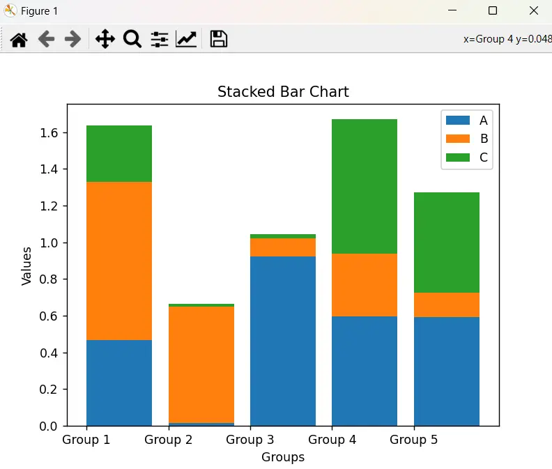
Adjusting Bar Width and Gaps
By default, Matplotlib automatically determines the width of the bars based on the number of groups and categories. However, you can adjust the width using the width parameter in the bar() function. For example:
ax.bar(groups, data[:, 0], label=categories[0], width=0.5)
In this code snippet, we set the width parameter to 0.5, resulting in thinner bars.
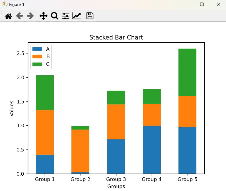
Additionally, you can control the gaps between the bars using the align parameter. For example:
ax.bar(groups, data[:, 0], label=categories[0], align='edge')
Setting align='edge' will align the bars to the edge of the group, reducing the gap between adjacent bars. Normally the bars have the “center” align, which means they are centered over the “tick” on the x-axis. Here is a stacked bar chart in matplotlib, with the “edge” align.
Look at the x-axis to notice the difference.
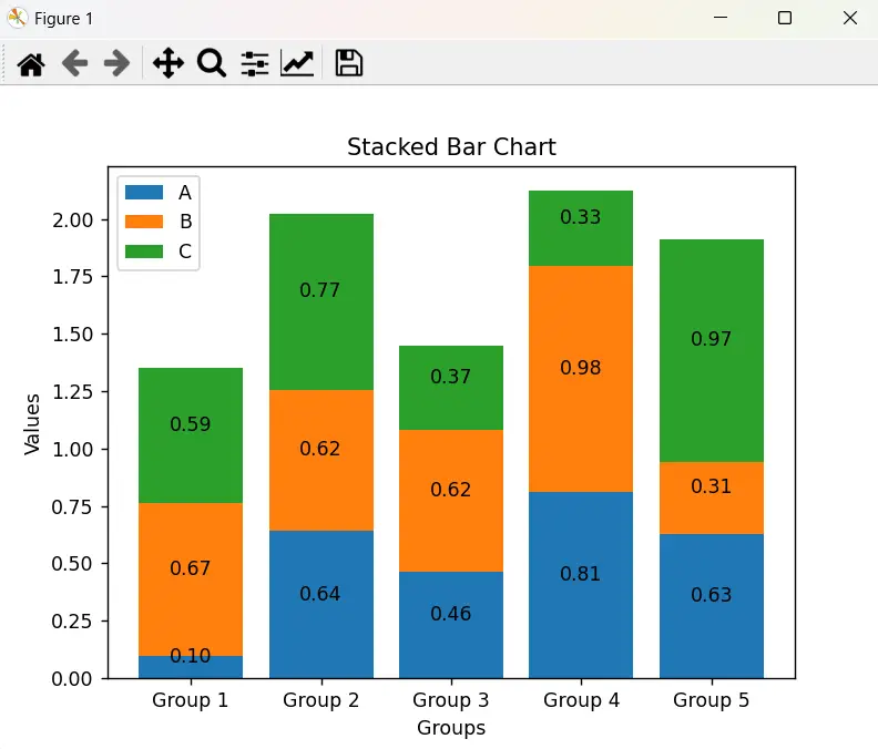
Adding Annotations and Data Labels
Annotations and data labels provide additional information and context to the stacked bar chart. Matplotlib allows you to add text annotations using the annotate() function and data labels using the text() function.
For example, let’s add annotations above each segment to indicate the exact values:
for i, category in enumerate(categories):
    for j, group in enumerate(groups):
        value = data[j, i]
        ax.annotate(f'{value:.2f}',
                    (group, np.sum(data[j, :i]) + value / 2),
                    ha='center',
                    va='bottom')
In this code snippet, we use nested loops to iterate through each category and group, and annotate() places the annotation above each segment. The ha='center' and va='bottom' parameters ensure the text is centered and positioned correctly.
This gives the following effect.
Similarly, let’s add data labels at the top of each bar to show the total values:
for j, group in enumerate(groups):
    total = np.sum(data[j])
    ax.text(group,
            total + 0.1,
            f'{total:.2f}',
            ha='center',
            va='bottom')
This code snippet uses a loop to iterate through each group, and text() adds the data label above the bar. The ha='center' and va='bottom' parameters ensure the label is centered and positioned above the bar.
Adding Legends and Adjusting Their Appearance
Legends play a crucial role in stacked bar charts, as they help identify each category. Matplotlib allows you to customize the appearance of legends, such as their location, background color, border, and font properties.
To adjust the legend position, you can use the loc parameter in the legend() function. For example:
ax.legend(loc='upper right')
This code snippet sets the legend to appear in the upper-right corner of the chart.
You can further customize the legend appearance using the bbox_to_anchor parameter. For example:
ax.legend(bbox_to_anchor=(1.02, 1), loc='upper left')
In this code snippet, the bbox_to_anchor parameter adjusts the position of the legend relative to the axes. The values (1.02, 1) push the legend slightly outside the axes to the upper-left corner.
Additionally, you can modify other legend properties, such as background color, border, and font properties using the facecolor, edgecolor, and prop parameters, respectively.
These are just a few examples of the advanced customization options available in Matplotlib. Experiment with different parameters to achieve the desired appearance for your stacked bar chart.
This marks the end of the Matplotlib Stacked Bar Chart Tutorial. Any suggestions or contributions for CodersLegacy are more than welcome. Questions regarding the tutorial content can be asked in the comments section below.