In this Python Matplotlib Tutorial we will explore how to plot a 2D Heatmap. A Heatmap is a type of graph which represents data in the form of colors. The different colors are used to represent different data values. For example, a temperature based heatmap will usually red to represent higher values, and white for lower values.
There are multiple ways of creating heatmaps in matplotlib. We will be discussing two such techniques in this tutorial.
Matplotlib 2D Heatmaps
The first method of plotting heatmaps is by using the imshow() function. (Normally used to display images).
We need some sample data to plot, we used the rand() function in numpy to generate a 2D array of dimensions 12 by 12, with values ranging from 0 to 1. We will now pass this into the imshow() function, and specify a color map (cmap). A color map decides what colors will be used in the graph. Matplotlib comes with dozens of colormaps you can use.
import matplotlib.pyplot as plt
import numpy as np

Z = np.random.rand(12, 12)

plt.imshow(Z, cmap='hot', interpolation='nearest')

plt.title('2-D Heat Map in Matplotlib')
plt.colorbar()
plt.show()
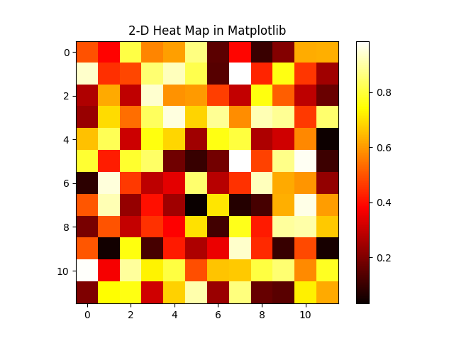
Here is our heatmap. We have used the “hot” color map, so we get colors like red, yellow and white which are normally used in temperate/heat based plots.

We also have a nice color bar that automatically detects the range of values. All we need to do is create it using plt.colorbar().
There is another method, using the pcolormesh() function. As you can see, the code is almost identical, except for the different function call (parameters remain the same).
import matplotlib.pyplot as plt
import numpy as np

Z = np.random.rand(12, 12)

plt.pcolormesh(Z , cmap = 'hot')

plt.title('2-D Heat Map in Matplotlib')
plt.colorbar()
plt.show()
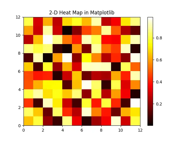
And here we have the same output. It looks a bit different, because the values are randomly generated.

Gradient Heatmaps in Matplotlib
Chances are that you are not satisfied with the square based heatmaps shown above. You want to see a more “gradient based” heatmap, also known as a “blurred” heatmap. Here is how you can do so.
x, y = np.meshgrid(np.linspace(-3, 3, 100), np.linspace(-3, 3, 100))
z = (1 - x*y) - np.sin(x**2 + y**2 )
z = z[:-1, :-1]
The idea is that you have an additional parameter called “Z” which controls the intensity of the color/value. We generate the values for Z using the values of X and Y which we randomly generated.
We need to remove the first and last value from Z, as shown in the third line above. This is because of a boundary value issue that will generate a warning if you do not do this. (X and Y are the bounds, Z should remain within them)
plt.pcolormesh(x, y, z, cmap='RdBu', vmin = -np.abs(z).max(),
                                     vmax = np.abs(z).max())
Here we need to use pcolormesh (not imshow). We will pass in our three datasets, set the color map as “Red to Blue” and define the min and max values for our heatmap.
The min and max values that we are using are not the literal min and max values from the Z-dataset. Rather, we are using the value with largest magnitude. Our goal is to ensure that the heatmap is uniform (which it might not be if we use the literal values). You can try it both ways, and see the difference for yourself. (You may end up needing the other technique depending on your data, so you should understand both)
Here is the final code.
import matplotlib.pyplot as plt
import numpy as np

x, y = np.meshgrid(np.linspace(-3, 3, 100), np.linspace(-3, 3, 100))
z = (1 - x*y) - np.sin(x**2 + y**2 )
z = z[:-1, :-1]

fig, ax = plt.subplots()
ax.set_title('Heatmap with Colormesh')

plt.pcolormesh(x, y, z, cmap='RdBu', vmin = -np.abs(z).max(),
                                     vmax = np.abs(z).max())
plt.colorbar()
plt.show()
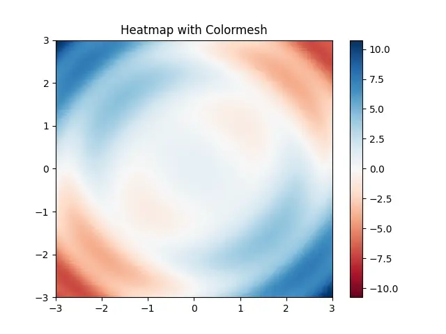
And here is our output. As you can see, this looks more like your typical heatmap.

This marks the end of the Plotting a 2D Heatmap With Matplotlib in Python Tutorial. Any suggestions or contributions for CodersLegacy are more than welcome. Questions regarding the tutorial content can be asked in the comments section below.

this is great, but how do i incorporate my x,y,z data to use this plot? you have shown how to do it with random numbers…
The random numbers we generated were just placeholders. Just replace them with your own values. Like this function here,
plt.pcolormesh(x, y, z)
Put your x-data in place of the x-parameter, y-data in place of the y-parameter, and so on.
I have an array with x,y & z data where the value z = f(x.y) so I want to map the z-value that corresponds to the x & y values at that z-point…your array is just 2×2 (x,y), correct?