
In this Matplotlib Tutorial, we will discuss how to plot and customize the Bar Graph. The Bar Graph (also known as Bar Chart or Bar Plot) is used to plot multiple pieces (or sets) of data in the form of vertical bars. It is most often used for comparison purposes (such as popularity, temperature, expenses etc.)
In this tutorial we will discuss various customizations, and several variants of the Bar Graph available in Matplotlib.
Plotting a Bar Graph in Matplotlib
Plotting a Bar Graph in Matplotlib is actually a very simple task. We just need the data for the x and y axis, which we can then pass into the bar() function.
from matplotlib import pyplot as plt

languages = ["C++", "Python", "Java", "JavaScript", "C#"]
popularity = [543, 3234, 4324, 5764, 2323]

fig, ax = plt.subplots()
bars = ax.bar(languages, popularity)

plt.show()
Here is our output.
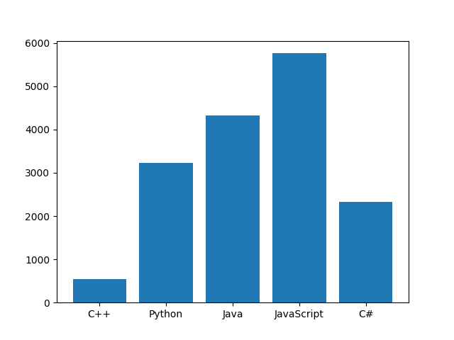
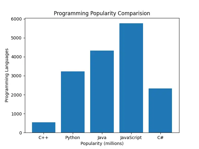
Our Bar graph right now carries very little meaning, and without context, no one will understand what it represents. An easy way of fixing this problem, is to add a heading and appropriate labels to our Graph.
from matplotlib import pyplot as plt

languages = ["C++", "Python", "Java", "JavaScript", "C#"]
popularity = [543, 3234, 4324, 5764, 2323]

fig, ax = plt.subplots()
bars = ax.bar(languages, popularity)

plt.title("Programming Popularity Comparision")
plt.xlabel("Popularity (millions)")
plt.ylabel("Programming Languages")
plt.show()
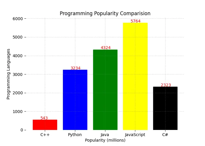
If we want a more colorful and customized graph, we can make a few more changes as shown below. We have done three things in total.
- Increased the Figure size using figsize.
- Given each individual bar a new color, by iterating over the bars object, and setting the colors individually.
- Removed the borders around the Matplotlib Bar graph (called spines)
from matplotlib import pyplot as plt

languages = ["C++", "Python", "Java", "JavaScript", "C#"]
popularity = [543, 3234, 4324, 5764, 2323]

fig, ax = plt.subplots(figsize = (7, 5))
bars = ax.bar(languages, popularity)

colors = [ "red", "blue", "green", "yellow", "black"]
for index, bar in enumerate(bars):
    bar.set_color(colors[index])

for s in ["top", "bottom", "left", "right"]:
    ax.spines[s].set_visible(False)

plt.title("Programming Popularity Comparision")
plt.xlabel("Popularity (millions)")
plt.ylabel("Programming Languages")
plt.show()
As you can see, our Bar Graph looks quite different (and colorful) now.

We can take things a step further, and add ourselves a “grid” and some additional text onto our Bar graph. The grid gives us a nice look, whereas the text makes it easier to compare and see the exact values for each bar (this is really useful when you have large values on the Y-axis)
from matplotlib import pyplot as plt

languages = ["C++", "Python", "Java", "JavaScript", "C#"]
popularity = [543, 3234, 4324, 5764, 2323]

fig, ax = plt.subplots(figsize = (7, 5))
bars = ax.bar(languages, popularity)

colors = [ "red", "blue", "green", "yellow", "black"]
for index, bar in enumerate(bars):
    bar.set_color(colors[index])

for s in ["top", "bottom", "left", "right"]:
    ax.spines[s].set_visible(False)

ax.grid(visible = True, color = "grey", alpha = 0.3, linewidth = 0.75,
        linestyle="--")

for patch in ax.patches:
    plt.text(patch.get_x() + 0.25, patch.get_height() + 25,
             str(round(patch.get_height(), 2)), color = "red")

plt.title("Programming Popularity Comparision")
plt.xlabel("Popularity (millions)")
plt.ylabel("Programming Languages")
plt.show()
Matplotlib Bar Graph Variants
There are three different variants (excluding the normal bar graph) of Bar Charts in Matplotlib. Here is the code for each one of them, along with the output and a brief description.
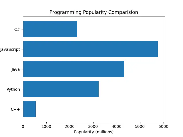
Horizontal Bar Chart
To create a Horizontal Bar chart, all we need to do is replace the bar() function with the barh() function. And that’s all!
import matplotlib.pyplot as plt

languages = ["C++", "Python", "Java", "JavaScript", "C#"]
popularity = [543, 3234, 4324, 5764, 2323]

fig, ax = plt.subplots()
bars = ax.barh(languages, popularity)

plt.title("Programming Popularity Comparision")
plt.xlabel("Popularity (millions)")
plt.ylabel("Programming Languages")
plt.show()
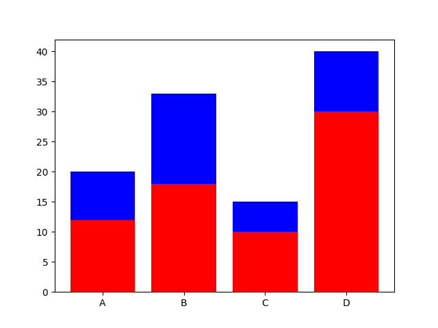
Stacked Bar Graph
A stacked Bar graph consists of multiple Bar graphs plotted on top of each other. This can be achieved by plotting two (or more) Bar Graphs, while making use of the bottom parameter (which defines the starting vertical position for a bar)
# Stacked Barchart
import matplotlib.pyplot as plt

xdata = ['A', 'B', 'C', 'D']
ydata1 = [12, 18, 10, 30]
ydata2 = [8, 15, 5, 10]

plt.bar(xdata, ydata1, color='red')
plt.bar(xdata, ydata2, bottom=ydata1, color='blue')
plt.show()
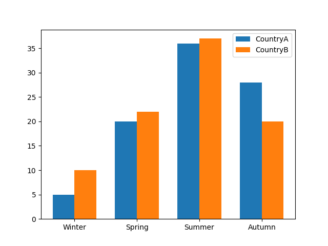
Grouped Bar Chart
Grouped Bar Charts involve clumping together multiple Bars in order to better compare two (or more) sets of data. All you have to do is plot another bar graph, while making some adjustments to the width and the x-axis starting point to accommodate the other graph(s).
import matplotlib.pyplot as plt
import numpy as np

labels = ['Winter', 'Spring', 'Summer', 'Autumn']
countryA = [5, 20, 36, 28]
countryB = [10, 22, 37, 20]

x = np.arange(len(labels))   # [0, 1, 2, 3]
width = 0.35

fig, ax = plt.subplots()
rects1 = ax.bar(x - width/2, countryA, width, label='CountryA')
rects2 = ax.bar(x + width/2, countryB, width, label='CountryB')

ax.set_xticks(x, labels)
ax.legend()

plt.show()
Interesting in learning more about Matplotlib? Check our tutorials collection on Matplotlib right now!
This marks the end of the Matplotlib Bar Graph & Variants Tutorial. Any suggestions or contributions for CodersLegacy are more than welcome. Questions regarding the tutorial content can be asked in the comment section below.