
Matplotlib is an incredible visualization library in Python. This visualization ability is incredibly useful due to its ability to show huge amounts of data in a visually appealing form. Matplotlib displays using arrays 2-D plots in the form of bar charts, pie charts, scatter plots, histograms and more.
Matplotlib is designed to work with Numpy’s 2-Dimensional arrays. Like Numpy, it is also a library used often in Scientific computing and Statistics. It would be best for you to have some basic Numpy knowledge for Matplotlib. See our Guide on Numpy here.
Installation
Make sure that you have python matplotlib and all it’s dependencies downloaded and installed before actually trying out any of the code. If you’re having problems, here’s a guide on how to how install matplotlib on a various operating systems and IDE’s.
Once you’ve installed matplotlib successfully, use the following import statement to import the pyplot module into your program.
from matplotlib import pyplotPyplot
Matplotlib is a massive library with many different uses. We could not hope to cover every aspect of it here. Hence, in this article we will just be dealing with Pyplot, a collection of functions within Matplotlib designed to make it work like MATLAB.
Pyplot is the part of Matplotlib that has most, if not all of the plotting functions. In the rest of this guide, we’ll briefly go through the various plotting functions one by one with examples. You can follow the links to access individual tutorials on each type of graph.
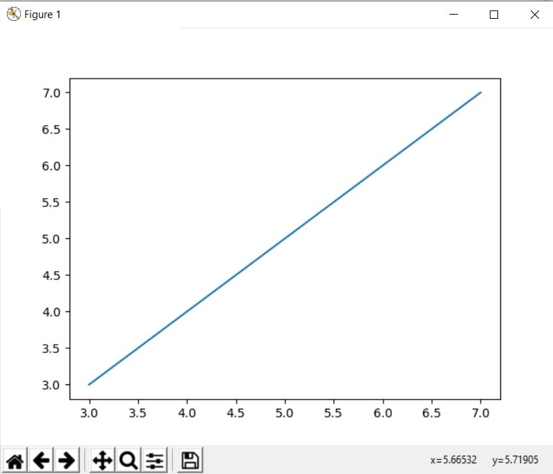
Line Plots
A line chart or line graph is a type of chart which displays information as a series of data points called ‘markers’ connected by straight line segments. Line graphs are most often used to find a relationship between two data sets on different axis, X and Y.
Bar Charts
The Bar Graph (also known as Bar Chart or Bar Plot) is used to plot multiple sets of data in the form of vertical (or horizontal) bars. It is most often used for comparison purposes (such as popularity, temperature, expenses etc.). Bar Charts in Matplotlib has several variations, such as Stacked, Grouped and Horizontal.
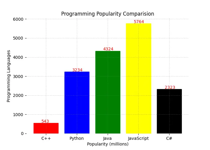
Pictured above is an example of Bar Chart which has been significantly customized using Matplotlib’s various parameters and functions.
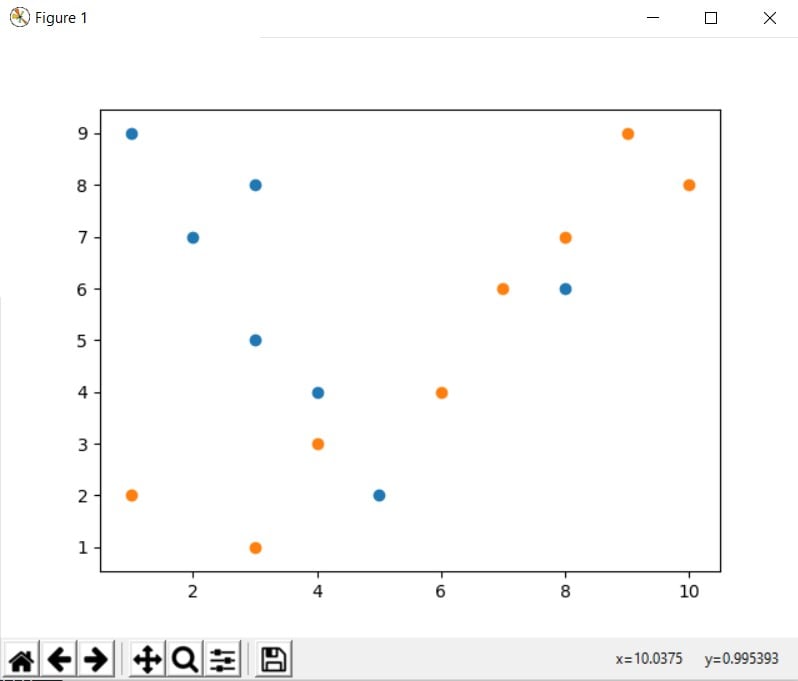
Scatter Plots
Python Matplotlib Scatter plots are used to plot data points on a horizontal and a vertical axis in the attempt to show how much one variable is affected by another. Best used on large spreads of data to look for co-relations or group points.
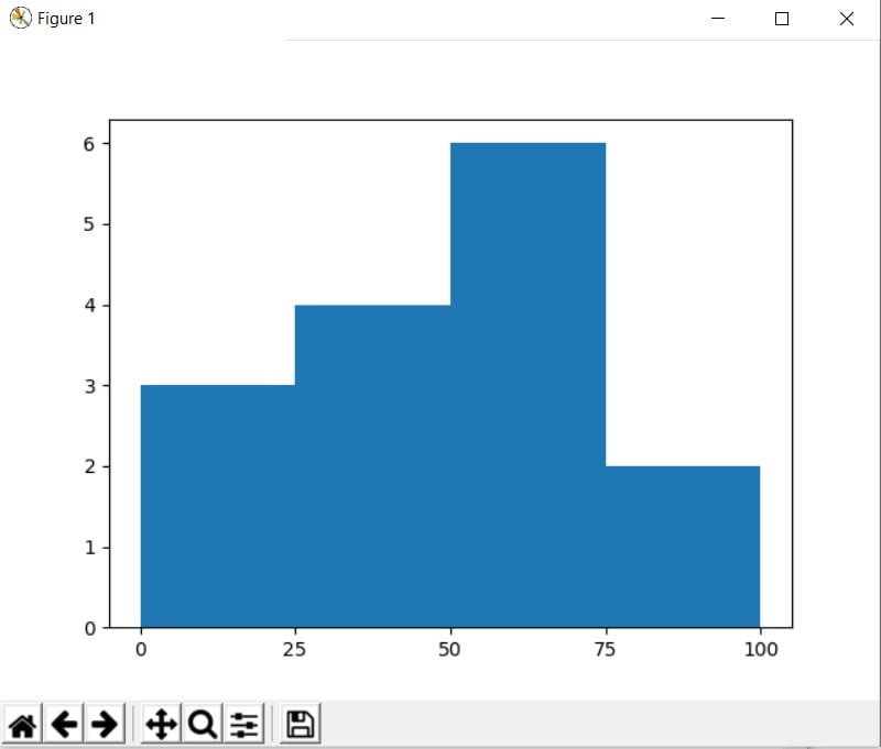
Histograms
A Python Matplotlib Histogram is able to graphically summarize the distribution of a data set. The keyword here is distribution. A Histogram can also taught of as a frequency table, that records the number of times a value falls within a certain interval (class interval.)
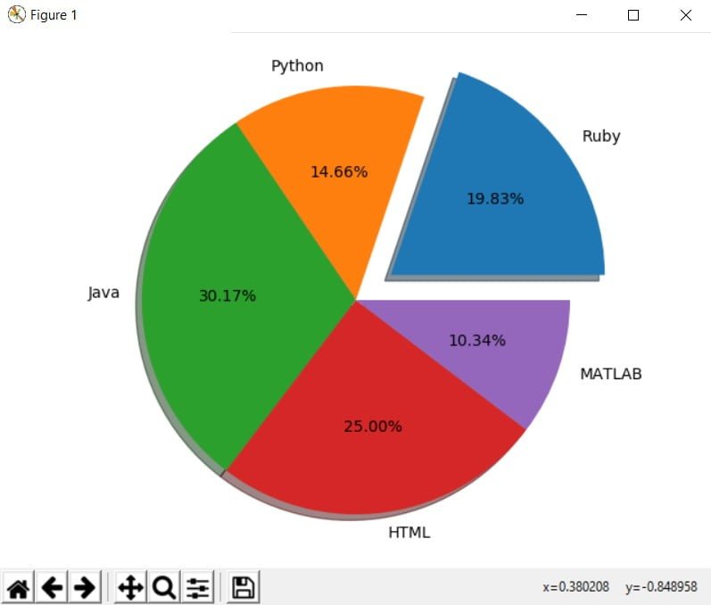
Pie charts
The Python Matplotlib Pie chart is a type of data visualization that shows items of varying size in a circle or ‘pie’. The size of the item, or ‘wedge’ is proportional to the sum of all items in the Pie chart.
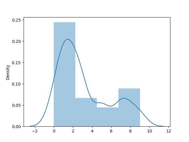
Density Plot
A density plot is a representation of the distribution of a numeric variable. We typically use Density plots to observe how a certain variable’s values are distributed in the dataset. Density plots are actually a variation of Histograms, a more smoothed out version that makes it easier to observe the distribution.
Is Matplotlib not what you were looking for? Looking for something more interactive and user-friendly? Why not try out the Pygal Graphing Library instead?
This marks the end of the Python matplotlib Article. Any suggestions or contributions for CodersLegacy are more than welcome. Relevant questions concerning the article can be asked in the comments section below.