
In this Article we’ll be exploring the use of the Python Matplotlib Pie Chart followed by several examples.
What is a Pie Chart?
The Python Matplotlib Pie chart is a type of data visualization that shows items of varying size in a circle or ‘pie’. The size of the item, or ‘wedge’ is proportional to the sum of all items in the Pie chart.
Pie Chart Example
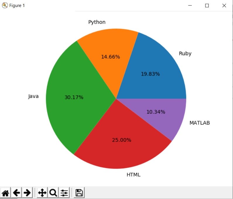
First create the standard object required to carry out functions using the plt.figure() and then defining it’s axis’s. Once this is done, pass the appropriate data sets into the pie() function.
Since this is all about proportions, we’re bound to run into Float values some where down the line. This is where the autopct comes in. It determines the number of decimal places allowed. Set to %1.2f%% for two decimal places, or maybe %1.1f%%' for one decimal place.
from matplotlib import pyplot as plt

languages = ['Ruby', 'Python', 'Java', 'HTML', 'MATLAB']
wieght = [23,17,35,29,12]

fig = plt.figure()
ax = fig.add_axes([0,0,1,1])
ax.pie(wieght, labels = languages , autopct='%1.2f%%')

plt.show()
Creating Multiple Pie Charts
To create multiple Pie charts, simply create wieght data set and pass it into a new pie() function. Here, since we are comparing the two Pie charts, we pass the same category languages into them.
from matplotlib import pyplot as plt

languages = ['Ruby', 'Python', 'Java', 'HTML', 'MATLAB']
wieght = [23,17,35,29,12]
wieght2 = [13,27,43,19,21]

fig = plt.figure()
ax = fig.add_axes([0,0,1,1])
ax.pie(wieght, labels = languages , autopct='%1.1f%%')

fig2 = plt.figure()
ax2 = fig2.add_axes([0,0,1,1])
ax2.pie(wieght2, labels = languages , autopct='%1.1f%%')

plt.show()
If you’ve been using the plt.pie method uptil now, don’t be confused. It’s the same thing, same syntax. This way just allows us to create objects. And it’s becuase of this that we can create multiple pie charts since we can create multiple objects.
Customizing Pie Charts
Pie charts have alot of customization options that help you modify the chart itself or put emphasis on certain wedges.
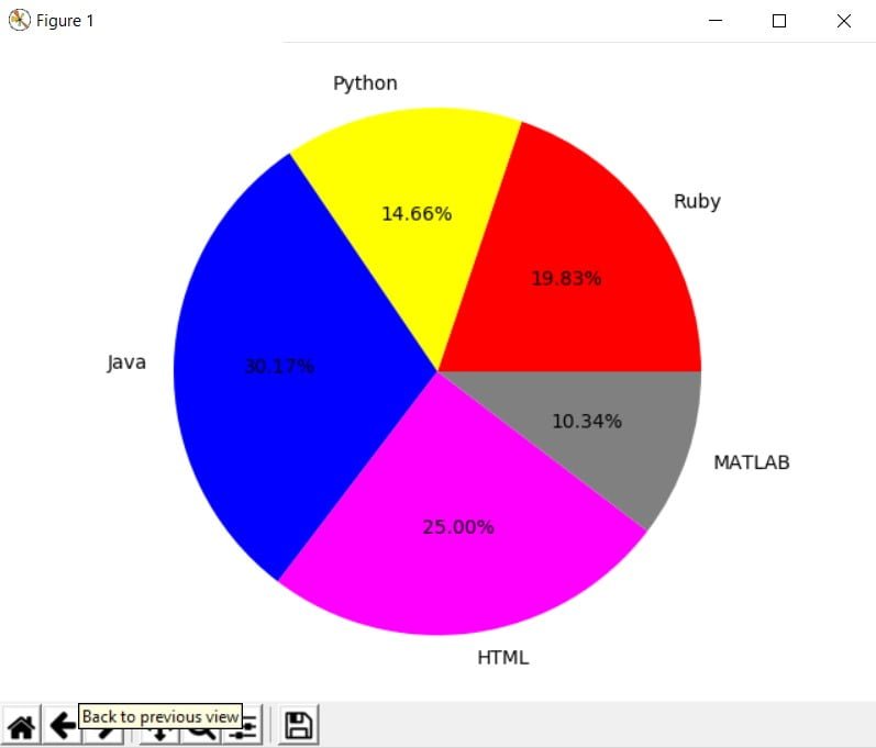
First up is the colors. All you have to do is add a new data set, and pass it into the colors parameter in the pie() function. Keep note of the order of the labels and colors in the their respective data sets. The 3rd color will assign itself to the 3rd Label for instance.
from matplotlib import pyplot as plt

languages = ['Ruby', 'Python', 'Java', 'HTML', 'MATLAB']
colors = ['Red','Yellow','Blue','Magenta','Grey']
wieght = [23,17,35,29,12]

fig = plt.figure()
ax = fig.add_axes([0,0,1,1])
ax.pie(wieght, labels = languages,
       colors = colors, autopct='%1.2f%%')

plt.show()
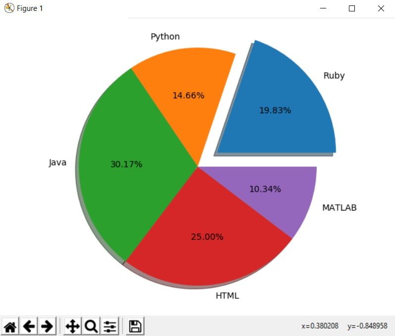
Two further interesting features are the explode and shadow parameters. Assigning shadow = True gives the Pie chart a more realistic and 3-D look. Where as explode separates a part of the pie chart, emphasizing it. The higher the value you set for explode, the further away the wedge will be.
from matplotlib import pyplot as plt

languages = ['Ruby', 'Python', 'Java', 'HTML', 'MATLAB']
wieght = [23,17,35,29,12]
explode = [0.2,0,0,0,0]

fig = plt.figure()
ax = fig.add_axes([0,0,1,1])
ax.pie(wieght, labels = languages , shadow = True,
       explode = explode, autopct='%1.2f%%')

plt.show()
This marks the end of our Python Matplotlib Pie Chart Tutorial. Let us know if have any questions or suggestions about the article content. Here’s a link back to the main Python Matplotlib section.