
In this tutorial we will explore how to create a 3D (three dimensional) Bar Chart in Python Matplotlib.
A Bar Chart/Graph is one of the most popular plots used to represent data. For most purposes, we use a 2D Bar chart that allows us to compare two sets of values at the same time (the x-axis and y-axis). However, sometimes we wish to simultaneously compare three sets of values/data, and that is where the 3D Bar Chart comes in.
How to make a 3D Bar Chart in Python
Let’s start off by collecting some data.
countries = ["Australia", "Brazil", "Canada", "France"]
years = [2005, 2010, 2015]
data = np.array([[1.8, 20.4, 2.1, 1.6],
                 [1.3, 18.1, 1.2, 2.3],
                 [0.8, 27.8, 1.4, 1.3]])

numOfCols = 4
numOfRows = 3
Here we have our three sets of data. First we have a list of countries. Second, we have a list of years from 2005 to 2015, with 5 years intervals.
Lastly, we have a 2D array that stores the homicide rates per 100,000 people for each country in each year. Each row represents the homicide data for one year, and each column represents the homicide data for a single country.
import matplotlib.pyplot as plt
import numpy as np

fig = plt.figure()
ax = plt.axes(projection = "3d")
Here we have made the required imports, and created the matplotlib figure and a 3D axes objects. These are the backbone of our matplotlib application.
xpos = np.arange(0, numOfCols, 1)
ypos = np.arange(0, numOfRows, 1)
xpos, ypos = np.meshgrid(xpos + 0.5, ypos + 0.5)
Now it’s time to begin generating some coordinate data for the X-axis positions and Y-axis positions. These coordinates will specify where Bars will be showing up on the 3D Chart.
[[0.5 1.5 2.5 3.5]
 [0.5 1.5 2.5 3.5]
 [0.5 1.5 2.5 3.5]]
This is what the coordinate data for “xpos” looks like right now. You might wonder why it’s a 2D array right now, instead of a 1D array that we created earlier. But remember we used np.meshgrid, which turned it from a single array to a grid (a 2D array basically). This is nessacery for 3D plots.
xpos = xpos.flatten()
ypos = ypos.flatten()
zpos = np.zeros(numOfCols * numOfRows)
Matplotlib does not accept 2D arrays though, so we must “flatten” the 2D array into a 1D array. (No values are lost, only the dimensions changed as the internal arrays are combined together).
Lastly we initialize zpos to 0, because we want all of our Bars to be starting from the 0th value on the Z-axis. (Z-axis is verticle).
dx = np.ones(numOfRows * numOfCols) * 0.5
dy = np.ones(numOfCols * numOfRows) * 0.5
dz = data.flatten()
Now that we have the origin coordinates, we need to specify the depth (you can think of this as the height, length and width). For dx (length) and dy (width), we would normally make an array of 1’s, but we want some space between the bars, so we make them of size 0.5.
Lastly, for dz (height) we use the original values from earlier (the homicide rates).
ax.bar3d(xpos, ypos, zpos, dx, dy, dz)
ax.set_xticklabels(countries)
ax.set_yticklabels(years)

ax.set_xlabel('Countries')
ax.set_ylabel('Over the years')
ax.set_zlabel('Number of Homicide cases')
Finally, we pass all the arrays we created into the bar3d() method. To make the Chart more understandable, we also added the correct labels and ticks.
The Complete Code
import matplotlib.pyplot as plt
import numpy as np

fig = plt.figure()
ax = plt.axes(projection = "3d")

countries = [" ","Australia", " ","Brazil", " ","Canada", " ","France"]
data = np.array([[1.8, 20.4, 2.1, 1.6],
                 [1.3, 18.1, 1.2, 2.3],
                 [0.8, 27.8, 1.4, 1.3]])
years = [None, None, 2005, None, 2010, None, 2015]

numOfCols = 4
numOfRows = 3

xpos = np.arange(0, numOfCols, 1)
ypos = np.arange(0, numOfRows, 1)
xpos, ypos = np.meshgrid(xpos + 0.5, ypos + 0.5)

xpos = xpos.flatten()
ypos = ypos.flatten()
zpos = np.zeros(numOfCols * numOfRows)

dx = np.ones(numOfRows * numOfCols) * 0.5
dy = np.ones(numOfCols * numOfRows) * 0.5
dz = data.flatten()

ax.bar3d(xpos, ypos, zpos, dx, dy, dz)
ax.set_xticklabels(countries)
ax.set_yticklabels(years)

ax.set_xlabel('Countries')
ax.set_ylabel('Over the years')
ax.set_zlabel('Number of Homicide cases')

plt.show()
Here is our output:
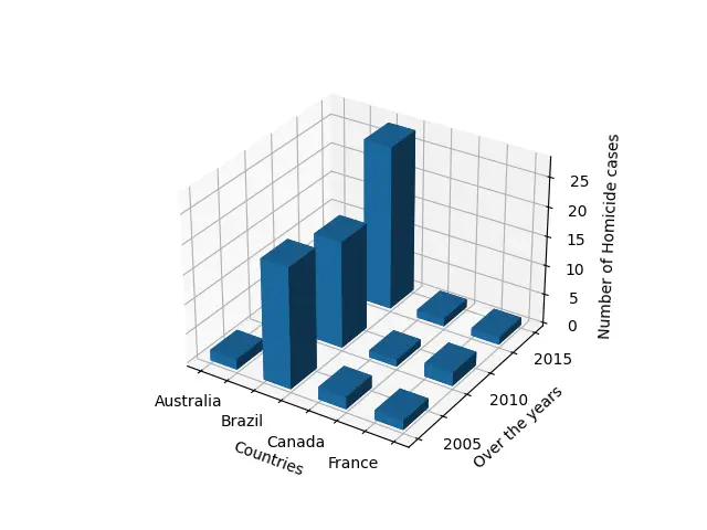
You may have noticed earlier in the data sets that we modified them slightly by adding in a null value between each normal value. We did this to space them out a bit, due to the difficult nature of adjusting ticks on Matplotlib.
This marks the end of the 3D Bar Chart in Matplotlib Tutorial. Any suggestions or contributions for CodersLegacy are more than welcome. Questions regarding the tutorial content can be asked in the comments section below.
Hello, thanks for the tutorial. Is there a way to add a color gradient to the bars?