
A Surface Plot is a representation of three-dimensional data, used to observe the relation between two independent variables (X and Z), and one dependent variable (Y). A Surface Plot is 3D in nature, and today we will explore how to create them using Matplotlib.
If you have any experience with Wire graphs, you should know that the Surface Plot is very similar to it. The difference is in the appearance, where instead of wires, the Surface Plot is completely filled with polygons.
How to make a 3D Surface Plot
Let’s start this tutorial by creating a simple version of a 3D Surface Plot in Matplotlib.
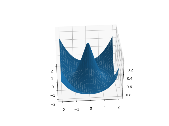
First we need to gather the required data. Since this is a tutorial, we will be generating some random data using numpy. Instead of generating random data for “Z” though, we used a function instead which will produce an interesting pattern.
Once you have the required data (X-data, Y-data, Z-data) pass it into the plot_surface() method of the axes object.
import matplotlib.pyplot as plt
import numpy as np

def f(x, y):
    return np.sin( np.sqrt(x**2 + y**2) )

x = np.linspace(-2, 2, 30)
y = np.linspace(-2, 2, 30)
X, Y = np.meshgrid(x, y)
Z = f(X, Y)

fig = plt.figure()
ax = plt.axes(projection = "3d")

ax.plot_surface(X, Y, Z)
plt.show()
Customizing Surface Plots
By default the Surface Plot is rather plain and doesn’t tell us alot about the data it is representing. Let’s make a few changes to our surface plot to make it more informative and easier to read.
We have made two additions in the below code. First we added a color map (which adds color gradients to the plot) and a color bar (used for the interpretation of the colors and the values they represent).
from matplotlib import cm
import matplotlib.pyplot as plt
import numpy as np

def f(x, y):
    return np.sqrt( np.sqrt(x**2) + np.sqrt(y**2) )

x = np.linspace(-3, 3, 30)
y = np.linspace(-3, 3, 30)
X, Y = np.meshgrid(x, y)
Z = f(X, Y)

fig = plt.figure()
ax = plt.axes(projection = "3d")

plot = ax.plot_surface(X, Y, Z, cmap = cm.coolwarm)
fig.colorbar(plot, shrink = 0.8)
plt.show()
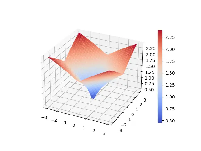
This surface plot makes alot more sense. Even without the color bar we can see the Red regions represents the higher values, and Blue represents low values.
You may also be interested in Contour Plots, as they are usually drawn together with Surface Plots to show the relationship between data.
This marks the end of the Python Matplotlib – 3D Surface plot Tutorial. Any suggestions or contributions for CodersLegacy are more than welcome. Questions regarding the tutorial content can be asked in the comments section below.