
Contour Plots are a special type of Graph used to represent 3D Surfaces on a two-dimensional plane. It works by taking “slices” of the 3D Surface, and drawing corresponding lines on the 2D Plane. Today’s tutorial will be demonstrating how we can create Contour Plots using the Python Library Matplotlib.
Common uses of Contour Plots are in areas where elevation plays a role, such as topography (e.g: Mountain and Hills). Different Colors are used to represent different levels of elevation. For example, a mountain might be
If you want to see how Contour Plots are used together with Surface Plots, follow this link.
Plotting Contours in Matplotlib
Let’s take a look at how we can plot a simple Contour Plot in matplotlib. Before we get around to that though, we need to prepare some data. We will be using the NumPy library to generate some data for us to use.
x = np.linspace(0, 5, 50)
y = np.linspace(0, 5, 50)
First we use np.linspace() to generate 50 numbers from 0 to 5. We do this for both x-values and y-values.
Now remember we need a “Z” value as well, as Contour Plots use 3D data. In order to generate a realistic Contour plot, we will use a function to generate some unique elevation (Z) data for us.
def f(x, y):
    return np.sin(x) ** 8 + np.cos(20 + y * x) * np.cos(y)

X, Y = np.meshgrid(x, y)
Z = f(X, Y)
The above code passes the x and y arrays into the function, which return a Z array of values. Now let’s begin plotting!
fig, ax = plt.subplots()

plt.contour(X, Y, Z)
plt.colorbar()
plt.show()
This part was very straight forward. We pass in our 3 arrays into the contour() function. Then we call the colorbar() function, which produces a color bar to the side of our plot. Finally calling plt.show() displays the plot on the window.
import matplotlib.pyplot as plt
import numpy as np

def f(x, y):
    return np.sin(x) ** 8 + np.cos(20 + y * x) * np.cos(y)

x = np.linspace(0, 5, 50)
y = np.linspace(0, 5, 50)
X, Y = np.meshgrid(x, y)
Z = f(X, Y)

fig, ax = plt.subplots()

plt.contour(X, Y, Z)
plt.colorbar()
plt.show()
Here is our output:
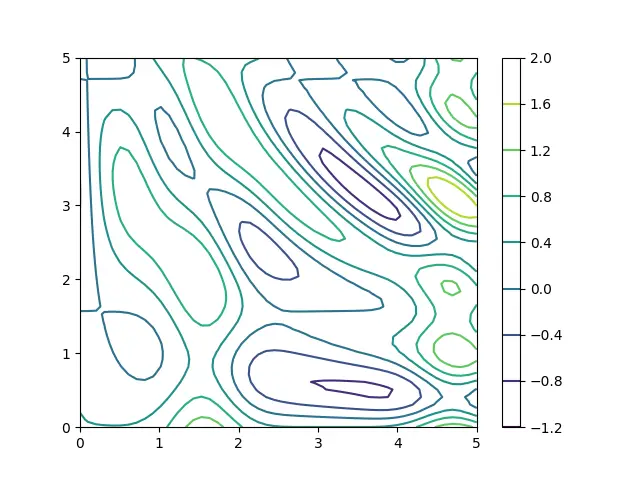
The above Contour Plot can be a little hard to decipher. We do have the color bar in side, which shows which colors correspond to which values, but it’s not very easy on the eyes. Let’s try and improve this.
Identifying Troughs (Low elevation areas)
The below code will generate a contour plot in just one color, black. In this mode, the troughs will be made with dotted lines. This makes it very easy to quickly identify troughs amongst all the other peaks.
import matplotlib.pyplot as plt
import numpy as np

def f(x, y):
    return np.sin(x) ** 8 + np.cos(20 + y * x) * np.cos(y)

x = np.linspace(0, 5, 50)
y = np.linspace(0, 5, 50)
X, Y = np.meshgrid(x, y)
Z = f(X, Y)

fig, ax = plt.subplots()

plt.contour(X, Y, Z, colors = "black")
plt.colorbar()
plt.show()
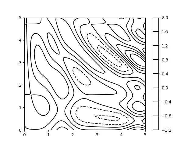
This isn’t perfect however, as it doesn’t help us with the peaks, or the regular areas. Let’s try again.
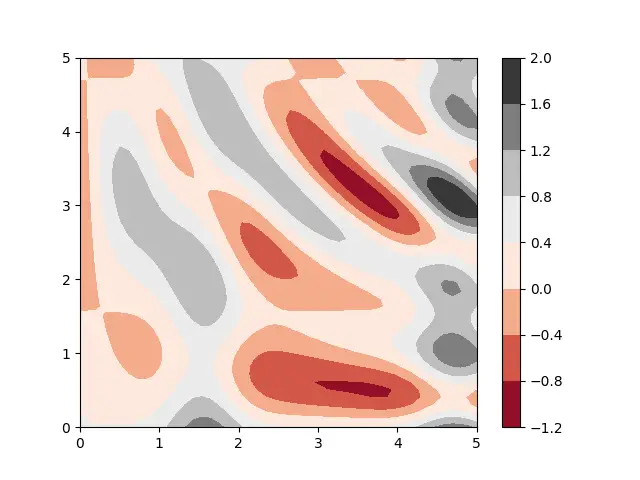
Using Color Maps in Contour Plots
This time we will use the contourf() function which takes the exact same parameters. We will also pass a new parameter in called cmap (color map) which controls which colors are used. You can look up more colormaps online if you are interested.
import matplotlib.pyplot as plt
import numpy as np

def f(x, y):
    return np.sin(x) ** 8 + np.cos(20 + y * x) * np.cos(y)

x = np.linspace(0, 5, 50)
y = np.linspace(0, 5, 50)
X, Y = np.meshgrid(x, y)
Z = f(X, Y)

fig, ax = plt.subplots()

plt.contourf(X, Y, Z, cmap='RdGy')
plt.colorbar()
plt.show()
The color map we have picked is RdGy, which is basically just the words Red and Grey combined. This will show the troughs as Red (low elevation), and the Peaks (high elevation) as Gray.
Now look at the below Contour Plot. Makes alot more sense now doesn’t it?
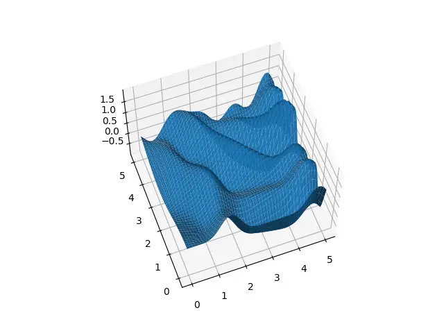
Surface Plots
Finally, let’s actually take a look at what the 3D Surface Plot for this data looks like. Put it side by side with the Contour Plot above, and notice the similarities! Every peak in the Surface Plot will correspond to the black color, likewise the troughs will correspond to red color.
If you want to learn more about Contour Plots, check our 3D Contour Plots Tutorial for more!
This marks the end of the Contour Plots with Python Matplotlib Tutorial. Any suggestions or contributions for CodersLegacy are more than welcome. Questions regarding the tutorial content can be asked in the comments section below.