
In this tutorial we will be exploring how to create our very own Colormaps. There are various types of Colormaps in Matplotlib, but in this tutorial we will be exploring the LinearSegmentedColormap.
This is a type of colormap where we have several anchor points which divide our colormap into segments. Each anchor point has its own assigned color. Between every two anchor points exists a segment, and the color of this segment starts out with the color of anchorpoint "A" and linearly changes until it has the color of anchorpoint "B".
Lets take a look at some examples!
Matplotlib LinearSegmentedColormap Examples
There are multiple ways to create a LinearSegmentedColormap, but the easiest is to use from_list() function. This function takes three parameters.
- A name for the colormap
- A list of tuples with the anchor points and their corresponding colors. Anchor points have values from 0 to 1, and colors use hexacodes for RGB values.
- The number of RGB values (default value is 256)
colormap = LinearSegmentedColormap.from_list('custom',
                                       [(0, '#00ff00'),
                                        (1, '#ff0000')], N=256)
The main parameter is the second one, where we pass in the anchor points. There is an important rule to remember about anchor points. There should always be an anchorpoint on “point 0” and an anchorpoint on “point 1”. We can place additional anchor points in the middle.
With our current colormap, the lowest values in our dataset will have the color Green (#00ff00) and the highest values will be the color Red (#ff0000). Since this is a LinearSegmentedColormap, it will automatically make the colors change linearly from Green to Red.
Here is the complete code + output. We have used Contour Plots as they require color maps to actually function properly. Heatmaps are another place where colormaps are essential.
import matplotlib.pyplot as plt
import numpy as np
from matplotlib.colors import LinearSegmentedColormap

colormap = LinearSegmentedColormap.from_list('custom',
                                       [(0, '#00ff00'),
                                        (1,   '#ff0000')], N=256)

def f(x, y):
    return np.sin(x) ** 8 + np.cos(20 + y * x) * np.cos(y)

x = np.linspace(0, 5, 50)
y = np.linspace(0, 5, 50)
X, Y = np.meshgrid(x, y)
Z = f(X, Y)

fig, ax = plt.subplots()

plt.contourf(X, Y, Z, cmap=colormap)
plt.colorbar()
plt.show()
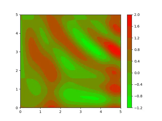
If we assume our dataset is about topography (mountains and gorges), we can clearly see where the mountain peaks are supposed to be, and where the gorges are. Most importantly, we also see the distribution of data properly.
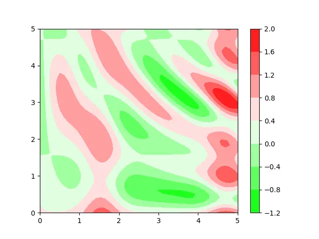
Adding Anchor Points
Good use of anchor points can help reveal more information about our data, narrow down the information we need, or present the data in a way we can better understand.
Lets add another anchor point to our colormap at the mid-way point. We will give this anchor point the color white.
colormap = LinearSegmentedColormap.from_list('custom',
                                       [(0, '#00ff00'),
                                        (0.5, '#ffffff'),
                                        (1,   '#ff0000')], N=256)
Our graph now shows the low and higher regions more clearly. This is because we used the middle anchor pint to declare a sort of “neutral” zone.
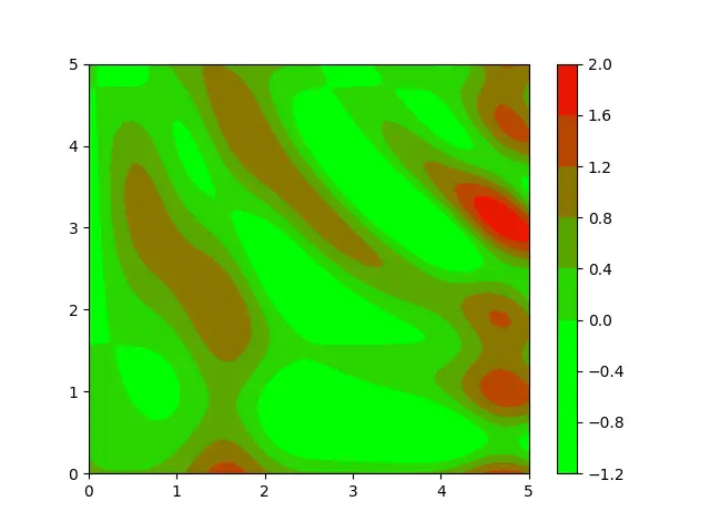
Another thing we can do with colormaps is reusing the same color. There are certain situations where such a trick will come in handy. Such as when you want to give higher priority to a certain color, or you don’t want your data to be completely uniform. (You can use lighter shades of the same color too)
colormap = LinearSegmentedColormap.from_list('custom',
                                       [(0, '#00ff00'),
                                        (0.33, '#00ff00'),
                                        (1,   '#ff0000')], N=256)
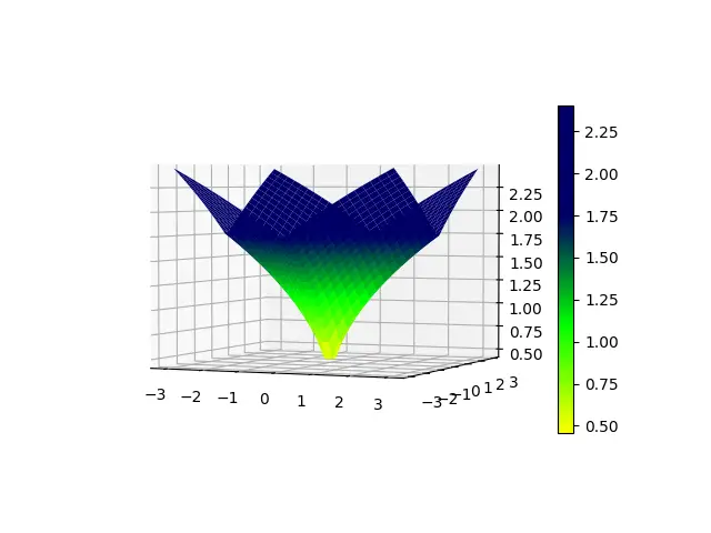
Example# 2
Here is another example for LinearSegmentedColormaps. We have used 4 anchor plots, with higher priority for the color “dark blue”. This time in-place of a Contour Plot we are using a Surface Plot to represent our data.
import matplotlib.pyplot as plt
import numpy as np
from matplotlib.colors import LinearSegmentedColormap

colormap = LinearSegmentedColormap.from_list('custom',
                                       [(0, '#ffff00'),
                                        (0.33, '#00ff00'),
                                        (0.66,   '#000066'),
                                        (1,   '#000066')], N=256)

def f(x, y):
    return np.sqrt( np.sqrt(x**2) + np.sqrt(y**2) )

x = np.linspace(-3, 3, 30)
y = np.linspace(-3, 3, 30)
X, Y = np.meshgrid(x, y)
Z = f(X, Y)

fig = plt.figure()
ax = plt.axes(projection = "3d")

plot = ax.plot_surface(X, Y, Z, cmap = colormap)
fig.colorbar(plot, shrink = 0.8)
plt.show()
Adding LinearSegmentedColormap to Bar Charts
Here is another example where we add a LinearSegmentedColormap to a bar chart. It needs to be done a little differently here, as the bar() method does not accept a cmap, rather it accepts “colors”. The colormap that we have created is itself, a function. We will pass our data into this function, and the colormap will automatically produce the required colors.
from matplotlib import pyplot as plt
from matplotlib.colors import LinearSegmentedColormap
import numpy as np

colormap = LinearSegmentedColormap.from_list('custom',
                                       [(0, '#00ff00'),
                                        (1,   '#ff0000')], N=256)

languages = ["C++", "Python", "Java", "JavaScript", "C#"]
popularity = np.array([543, 3234, 4324, 5764, 2323])

fig, ax = plt.subplots()
bars = ax.bar(languages, popularity,
              color = colormap(popularity/max(popularity)))

plt.show()

This marks the end of the Matplotlib LinearSegmentedColormap Tutorial. Any suggestions or contributions for CodersLegacy are more than welcome. Questions regarding the tutorial content can be asked in the comments section below.