
In this Matplotlib Tutorial, we will explore how to add the Slider Widget to our Matplotlib Graphs. The Slider widget presents to the user a interactable slider which can be used to select a value from a predefined range of values. This range of values can be both discrete and continuous, depending on our needs.
We will explore how the Slider Widget can be used effectively in this Matplotlib tutorial with the help of several examples code.
Creating a Slider Widget in Matplotlib
Before adding the Slider Widget, we will create a simple plot featuring the sin wave.
First we will make a few imports. Numpy to help us generate some data for our plot, and the slider widget from the Matplotlib widgets module. Next we generate the x and y axis data, create our matplotlib subplots and plot our data.
import numpy as np
import matplotlib.pyplot as plt
from matplotlib.widgets import Slider

x = np.linspace(0, 3, 300)
y = np.sin(5 * np.pi * x)

fig, ax = plt.subplots()
l, = ax.plot(x, y)
plt.show()
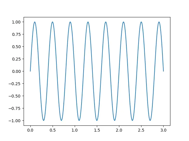
The image above shows the current output. Our goal is to add a slider widget that allows us to control the frequency of the sin wave.
The first thing we need to do is make some space for the Slider. Currently the graph takes up 100% of the space in the window. What we will do is move the bottom offset of the graph from the default “0” to “0.2” (max value is 1). This creates about 20% of vertical space at the bottom for us to place the Slider.
fig.subplots_adjust(bottom=0.2)
Next we add the slider. We need to create a new axes object for the Slider that we call slideraxis. A figure can actually host many axes objects, so don’t worry.
The add_axes() method takes a list with 4 values. First two values represent the starting X and Y position (from 0 to 1) and the last two values represent the width and height respectively (from 0 to 1).
slideraxis = fig.add_axes([0.25, 0.1, 0.65, 0.03])
slider = Slider(slideraxis, label='Frequency [Hz]',
                valmin=0, valmax=10, valinit=5)
slider.on_changed(onChange)
After that we create the Slider widget, passing in the newly created axis as the first parameter. The rest of the parameter control various other aspects of the Slider, like the minimum and maximum possible values you can select, and the default value of the slider (valinit).
The third line from the above code connects the Slider to the onChange() function, which we will define soon. Basically whenever the value of the Slider widget changes, the onChange() function will be called.
def onChange(value):
    l.set_ydata(np.sin(value * np.pi * x))
    fig.canvas.draw_idle()
Here is the definition for the onChange() function. The Slider widget automatically passes in an argument which contains the current value of the Slider. We will use this argument to update the data in our graph, and then redraw our graph.
Here is the complete code.
import numpy as np
import matplotlib.pyplot as plt
from matplotlib.widgets import Slider

x = np.linspace(0, 3, 300)
y = np.sin(5 * np.pi * x)

fig, ax = plt.subplots()
fig.subplots_adjust(bottom=0.2)
l, = ax.plot(x, y)

def onChange(value):
    l.set_ydata(np.sin(value * np.pi * x))
    fig.canvas.draw_idle()

slideraxis = fig.add_axes([0.25, 0.1, 0.65, 0.03])
slider = Slider(slideraxis, label='Frequency [Hz]',
                valmin=0, valmax=10, valinit=5)
slider.on_changed(onChange)
plt.show()
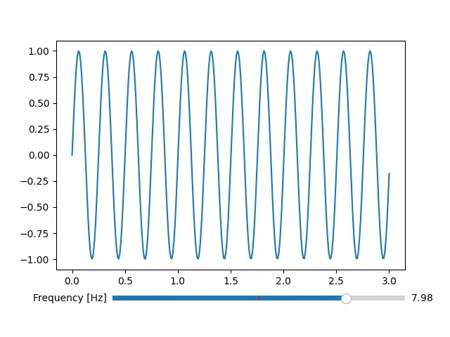
You can see the Slider widget at the bottom. If you look closely, you will see a red vertical bar at the halfway point, which represents the default/initial value that we picked earlier.
Slider Widget – Example#2
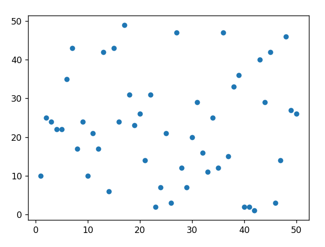
Lets take a look at a second example involving the Slider widget. We will working with a scatter plot this time, which makes use of two sliders.
First however, we need to create our base plot with the required data. Much of the code is similar to one from before. The only differences are that we shuffle the x-axis data (because we don’t want our data to be in sorted order), we make space on both the bottom and left side of the graph (for two sliders) and we change the markertype to dot, and linestyle to null to convert our graph to a Scatter plot. We also specify a markersize of 5.
import numpy as np
import matplotlib.pyplot as plt
from matplotlib.widgets import Slider

x = np.linspace(1, 50, 50)
np.random.shuffle(x)
y = np.random.randint(1, 50, 50)

fig, ax = plt.subplots()
fig.subplots_adjust(bottom=0.2, left=0.2)
l, = ax.plot(x, y, marker='o', ls='', ms=5)
plt.show()
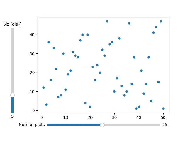
Now lets add some Sliders!
First we will add the Vertical slider (located to the left). Remember to change the orientation parameter explicitly to make it vertical properly. This Slider will control the size of the markers. We can increase or decrease the size of the “dots” on our scatter plot by adjusting this slider.
def onChangeSize(value):
    l.set_markersize(value)
    fig.canvas.draw_idle()

vslideraxis = fig.add_axes([0.05, 0.2, 0.03, 0.6])
vslider = Slider(vslideraxis,
                 label='Siz (dia)]',
                 valmin=1,
                 valmax=20,
                 valinit=5,
                 orientation="vertical")
vslider.on_changed(onChangeSize)
For the horizontal slider we will do something a bit unique. Normally the values on a Slider are continuous. For something like “dot size” this is usually ok. But we want a slider which controls the number of the dots being displayed. Now there is no such thing as “half” a dot, right? So we need to values to be discrete from 1 to 50 (there are 50 values in total) in increments of 1.
To do this we will make sure of the valstep parameter which takes a list of the discrete values that we want selectable. The linspace() function from numpy generates an array of values from 1 to 50, with increments of 1.
def onChange(value):
    l.set_data(x[:int(value)], y[:int(value)])
    fig.canvas.draw_idle()

hslideraxis = fig.add_axes([0.25, 0.1, 0.6, 0.03])
hslider = Slider(hslideraxis,
                 label='Num of plots',
                 valmin=min(np.linspace(1, 50, 50)),
                 valmax=max(np.linspace(1, 50, 50)),
                 valstep=np.linspace(1, 50, 50),
                 valinit=25)
hslider.on_changed(onChange)
Combining all these code snippets gives us the following code.
import numpy as np
import matplotlib.pyplot as plt
from matplotlib.widgets import Slider

x = np.linspace(1, 50, 50)
np.random.shuffle(x)
y = np.random.randint(1, 50, 50)

fig, ax = plt.subplots()
fig.subplots_adjust(bottom=0.2, left=0.2)
l, = ax.plot(x, y, marker='o', ls='', ms=5)

def onChange(value):
    l.set_data(x[:int(value)], y[:int(value)])
    fig.canvas.draw_idle()

def onChangeSize(value):
    l.set_markersize(value)
    fig.canvas.draw_idle()


vslideraxis = fig.add_axes([0.05, 0.2, 0.03, 0.6])
vslider = Slider(vslideraxis,
                 label='Siz (dia)]',
                 valmin=1,
                 valmax=20,
                 valinit=5,
                 orientation="vertical")
vslider.on_changed(onChangeSize)

hslideraxis = fig.add_axes([0.25, 0.1, 0.6, 0.03])
hslider = Slider(hslideraxis,
                 label='Num of plots',
                 valmin=min(np.linspace(1, 50, 50)),
                 valmax=max(np.linspace(1, 50, 50)),
                 valstep=np.linspace(1, 50, 50),
                 valinit=25)
hslider.on_changed(onChange)

plt.show()
Try running the code for yourself and interacting with these sliders to see the magic!
This marks the end of the Matplotlib Slider Widget Tutorial. Any suggestions or contributions for CodersLegacy are more than welcome. Questions regarding the tutorial content can be asked in the comments section below.