
Violin Plots are a special type of Graph in Matplotlib, used to represent the distribution of data. They shows us the min and max value, and how the data is spread out between this range (left-skewed or right-skewed etc.).
It is rather similar to the Box Plot (also known as Box and Whisker), but does a better job at showing the spread of data.
Plotting Violin Plots in Matplotlib
Lets take a look at an example for Violin Plots. We will be plotting multiple violin plots on the same graph. This is good for comparing the spread of data between different data sets.
dataset1 = np.random.normal(70, 20, 200)
dataset2 = np.random.normal(130, 40, 200)
dataset3 = np.random.normal(90, 80, 200)
dataset4 = np.random.normal(110, 50, 200)
First we will create the datasets (this won’t be needed if you already have the data) using the np.random.normal() function. This function returns a list of values from a normal (Gauss) distribution. The values are randomly selected, so we can expect to get a different result every time we run our code.
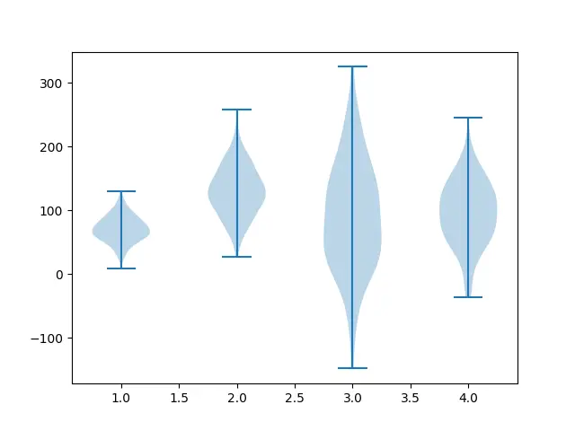
plt.violinplot([dataset1, dataset2, dataset3, dataset4])
After we have the dataset(s), all we need to do is pass it to the violinplot() method. This function will accept a single dataset, or a list of multiple datasets. Since we are plotting multiple datasets here, we will be passing them as a list.
Here is the complete code and output.
import matplotlib.pyplot as plt
import numpy as np

fig, ax = plt.subplots()

dataset1 = np.random.normal(70, 20, 200)
dataset2 = np.random.normal(130, 40, 200)
dataset3 = np.random.normal(90, 80, 200)
dataset4 = np.random.normal(110, 50, 200)

plt.violinplot([dataset1, dataset2, dataset3, dataset4])
plt.show()
Violin Plot Gridlines
We can also customize the graph a bit to make it easier for us to compare the different violin plots. One such useful customization is enabling horizontal grid lines.
This can be done using the yaxis.grid(True) method on the axis object.
plt.violinplot([dataset1, dataset2, dataset3, dataset4])
ax.yaxis.grid(True)
plt.show()
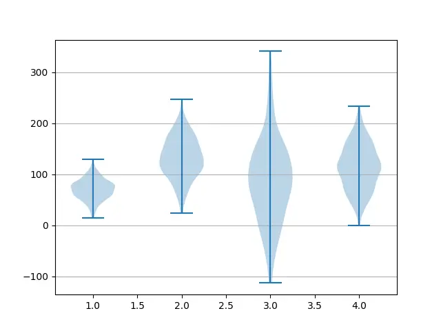
You can also use xaxis.grid(True) for vertical grid lines.
Plotting Medians
Currently it’s rather difficult to observe the mean value for a Violin plot. We can rectify this by passing in the value “True” to the showmeans parameter in the violinplot() method.
import matplotlib.pyplot as plt
import numpy as np

fig, ax = plt.subplots()

dataset1 = np.random.normal(70, 20, 200)
dataset2 = np.random.normal(130, 40, 200)
dataset3 = np.random.normal(90, 80, 200)
dataset4 = np.random.normal(110, 50, 200)

plt.violinplot([dataset1, dataset2, dataset3, dataset4], showmeans=True)
plt.show()
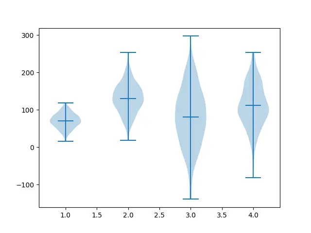
You can also have the medians plotted by passing “True” to the showmedians parameter.
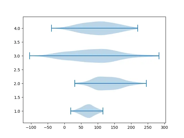
Horizontal Violin Plots
By using the vert parameter, and passing in the boolean value True we can create plot Violin plots horizontally.
plt.violinplot([dataset1, dataset2, dataset3, dataset4], vert=False)
plt.show()
This marks the end of the Matplotlib Violin Plots Tutorial. Any suggestions or contributions for CodersLegacy are more than welcome. Questions regarding the tutorial content can be asked in the comments section below.