
In this tutorial we’ll be exploring the use of the Python Matplotlib Line graph.
What is a Line graph?
A line chart or line graph is a type of chart which displays information as a series of data points called ‘markers’ connected by straight line segments.
Line graphs are most often used to find a relationship between two data sets on different axis, X and Y.
Line Graph Examples
Creating a Line Graph is fairly straightforward. You need sets of co-ordinates in the format shown below. Remember to have a equal number of x and y co-ordinates. Finally, you pass both data sets into the plot() function which creates the graph. This however, will not display the graph on your screen. For that you must use the show() command.
from matplotlib import pyplot as plt

#X co-ordinates
x = [3,4,5,6,7]

#Y co-ordinates
y = [3,4,5,6,7]

#Plotting the graph
plt.plot(x,y)

#Displaying Graph on Screen
plt.show()
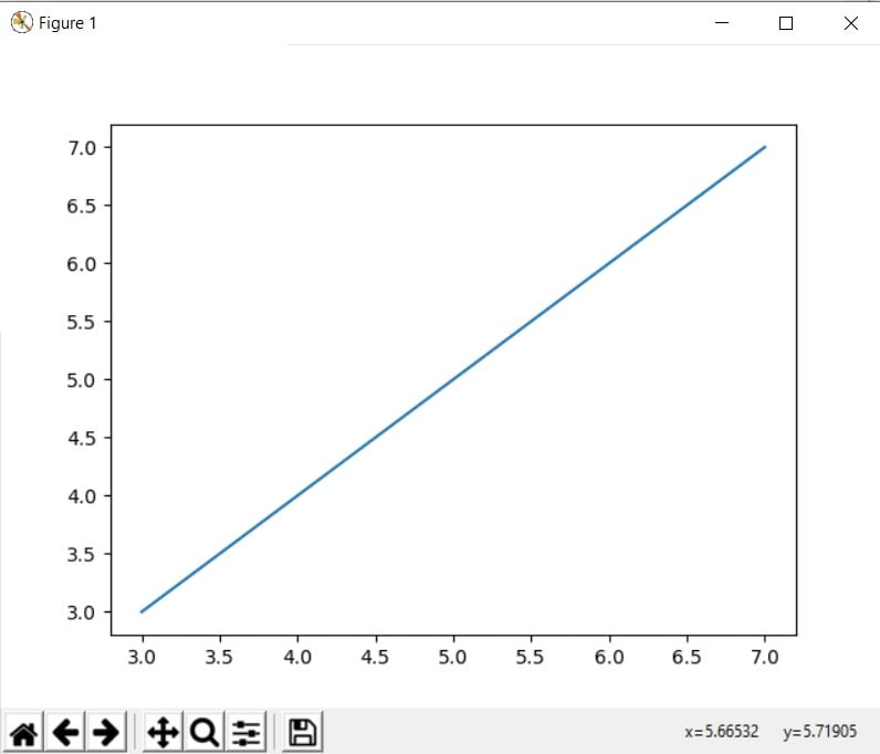
As you can see in the screen above we have a clearly labelled graph here, with extra tools, courtesy of matplotlib, available to us. These tools can be used to further manipulate and examine the graph.
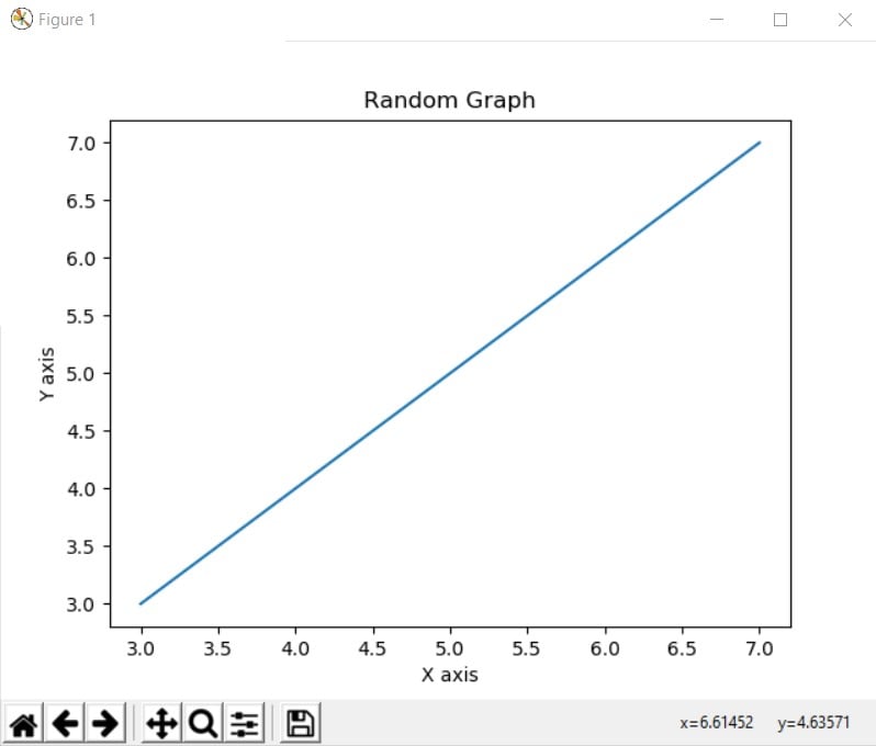
Using Labels
You can use Labels in your graph to label the X and Y axis, as well as the graph itself.
from matplotlib import pyplot as plt

x = [3,4,5,6,7]
y = [3,4,5,6,7]

plt.title("Random Graph")
plt.xlabel("X axis")
plt.ylabel("Y axis")

plt.plot(x,y)
plt.show()
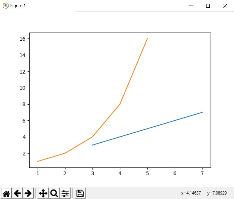
Multiple Line Graphs
You easily add more than one line graph to a single graph using the plot() again on a new set of co-ordinates.
from matplotlib import pyplot as plt

#X co-ordinates
x = [3,4,5,6,7]
x2 = [1,2,3,4,5]

#X co-ordinates
y = [3,4,5,6,7]
y2 = [1,2,4,8,16]

plt.plot(x,y)
plt.plot(x2,y2)

plt.show()
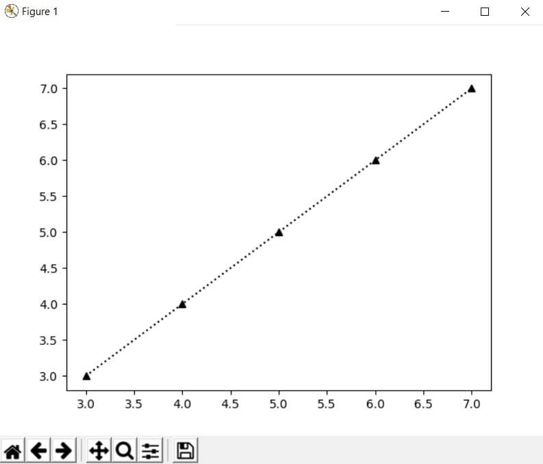
Customizing Line Graphs
Matplotlib has many customizing features for it’s line plots. You can change the markers at each co-ordinate and even the line that connects these markers. See the following two examples.
x = [3,4,5,6,7]
y = [3,4,5,6,7]

plt.plot(x, y, '^:k')
plt.show()
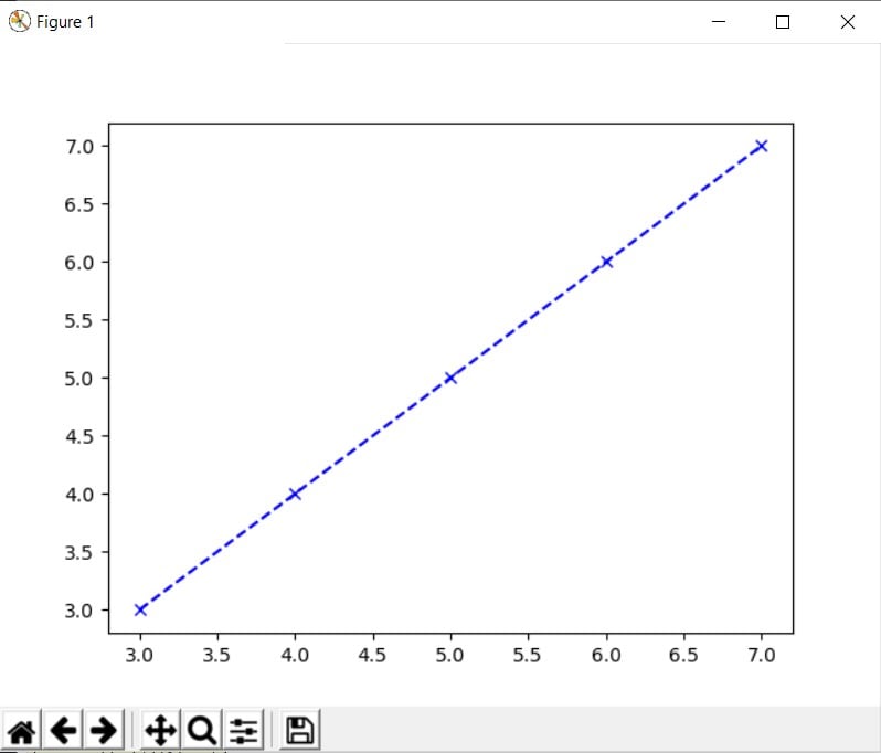
x = [3,4,5,6,7]
y = [3,4,5,6,7]

plt.plot(x,y, 'b--x')
plt.show()
How to configure such customizations? It’s simple. There is a list of codes for different colors, different markers and different line styles. Each code is a single character. You simply create a combination of codes as shown above, and voila.
The order of the combination does not matter. 'ob' is the same as 'bo'. 'g-' is the same as ‘-g'.
| Code | Color |
|---|---|
'b' | blue |
‘g' | green |
'r' | red |
'c' | cyan |
'm' | magenta |
'y' | yellow |
'k' | black |
'w' | white |
| Code | Description |
|---|---|
'-' | solid line style |
'--' | dashed line style |
'-.' | dash-dot line style |
':' | dotted line style |
| Code | Description |
|---|---|
'.' | point marker |
',' | pixel marker |
'o' | circle marker |
'v' | triangle_down marker |
'^' | triangle_up marker |
'<' | triangle_left marker |
'>' | triangle_right marker |
'1' | tri_down marker |
'2' | tri_up marker |
'3' | tri_left marker |
'4' | tri_right marker |
's' | square marker |
'p' | pentagon marker |
'*' | star marker |
'h' | hexagon1 marker |
'H' | hexagon2 marker |
'+' | plus marker |
'x' | x marker |
'D' | diamond marker |
'd' | thin_diamond marker |
'|' | vline marker |
'_' | hline marker |
This marks the end of our Python Matplotlib Line graph Article. Let us know if have any questions or suggestions. Use this link to head back to the main Matplotlib Article for more.