The Style Class is something new introduced by ttk, in order to improve upon Tkinter, and address a common complaint against it. Tkinter keeps both it’s logic code and styling options in the same area, whereas ttk uses the Style class to separate the styling from the widget logic.
ttk also expands upon the styling concept in Tkinter, for example, allowing us to create a style once, and then apply it on many widgets without having to re-write any code.
Table of Contents:
- Creating your own ttk Style
- Using Default ttk Styles
- ttk Themes
- List of Default Styles
Creating your own ttk Style
The first thing we will do in this ttk Tutorial, is explore how to create our own styles. (Default ttk Styles will be discussed later on).
Example# 1
In this example we’ll create a custom style for a ttk Button. When creating a style, we need a name for it which we will later assign in the style option for the widget. We use the naming convention “Name” + “.” + “Default Style”. So for the Button, whose default style name is “TButton”, we could call it “Custom.TButton”.
Using the style.configure() method, we can make changes to any style and also create any style. If the style name doesn’t exist, it will be created. We can change options like foreground, background, padding etc.
import tkinter as tk
import tkinter.ttk as ttk

class Window:
    def __init__(self, master):
        self.master = master

        frame = ttk.Frame(self.master)

        style = ttk.Style()
        style.configure("Custom.TButton",
                         foreground="black",
                         background="white",
                         padding=[10, 10, 10, 10],
                         font="Verdana 12 underline")

        bttn = ttk.Button(frame, text="Click Me!", style="Custom.TButton")
        bttn.pack()

        frame.pack(padx = 5, pady = 5)

root = tk.Tk()
root.geometry("200x150")
window = Window(root)
root.mainloop()
The output:
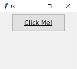
Now any widget we create and assign the Custom.TButton style, will have these attributes. It’s much simpler than having to rewrite the same options for each widget individually, which is what would happen in Tkinter, without ttk.
Example# 2
Let’s try another example, but for the Label instead this time.
class Window:
    def __init__(self, master):
        self.master = master

        frame = ttk.Frame(self.master)

        style = ttk.Style()
        style.configure("Custom.TLabel",
                         foreground="white",
                         background="black",
                         padding=[10, 10, 10, 10],
                         relief="raised")

        label = ttk.Label(frame, text="Hello World", style="Custom.TLabel")
        label.pack(padx = 5, pady = 5)

        frame.pack(padx = 5, pady = 5)

root = tk.Tk()
root.geometry("200x150")
window = Window(root)
root.mainloop()
The output:
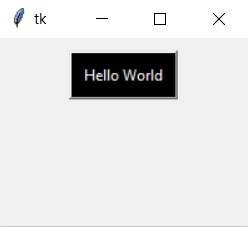
Refer to the bottom of this tutorial, for a complete list of default styles and their names. Also, if you end up customizing alot of your widget styles, you might want to consider defining your TTK styles in a separate file, and importing them from there.
Using Default Styles
We don’t always have to create a new style though. We have default styles as well which are enabled by default.
The below example shows a few widgets created with the default widget styles assigned to them.
import tkinter as tk
import tkinter.ttk as ttk

class Window:
    def __init__(self, master):
        self.master = master

        button = ttk.Button(self.master, text = "Click Me!")
        button.pack(padx = 5, pady = 5)

        label = ttk.Label(self.master, text = "This is a Label!")
        label.pack(padx = 5, pady = 5)

        checkbox = ttk.Combobox(self.master, values=["Option 1","Option 2"])
        checkbox.set("Option 1")
        checkbox.pack(padx = 5, pady = 5)

        radiobutton = ttk.Radiobutton(self.master, text="Radio Button")
        radiobutton.pack(padx = 5, pady = 5)

        checkbutton = ttk.Checkbutton(self.master, text="Check Button")
        checkbutton.pack(padx = 5, pady = 5)

        scale = ttk.Scale(self.master, from_=0, to=10)
        scale.pack(padx = 5, pady = 5)

        entry = ttk.Entry(self.master)
        entry.pack(padx = 5, pady = 5)

root = tk.Tk()
root.geometry('200x220')
window = Window(root)
root.mainloop()
The output:
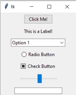
We can see what kind of values have been assigned to the style options for a widget using the lookup() method.
        style = ttk.Style()
        print(style.lookup("TButton", "font"))
        style.configure("TButton", font = "Verdana 12")
        print(style.lookup("TButton", "font"))
The output shows the value for the “font” option, before and after we changed it for the “TButton” widget.
TkDefaultFont
Verdana 12
The names of Default Styles are pretty easy to guess. For example, the Default Style for a Button is “TButton”, and for the Label, it’s “TLabel”. For a complete list of Tkinter Default Styles and their names, refer to the table at the bottom of this tutorial.
Modifying Default Styles
Another approach you can take, is to modify Default Styles using the style.configure() method.
A benefit here is that we don’t even need to assign the style option, because by default they all have the default style for that widget equipped. Any changes we make to the default style, will automatically change the appearance of all widgets for the group.
However this is also potentially problematic, as any changes you make will effect all the widgets of that type. So the original look will be lost forever. Which is why we actually go to the bother of making Custom Styles.
ttk Themes
Themes in ttk are basically a compilation of various styles and options for all the widgets inside of it. There are a bunch of themes available to us on our systems, which we can view using the following command.
import tkinter as tk
import tkinter.ttk as ttk

class Window:
    def __init__(self, master):
        s = ttk.Style()
        print(s.theme_names())
        print(s.theme_use())

root = tk.Tk()
window = Window(root)
root.mainloop()
('winnative', 'clam', 'alt', 'default', 'classic', 'vista', 'xpnative')
vista
The default theme for us is “vista”, however this will vary from OS to OS. The number and types of themes available will also vary from OS to OS.
This is what a tkinter ttk window with a few widgets can look like with different themes.
This is what Tkinter looks like without ttk widgets:
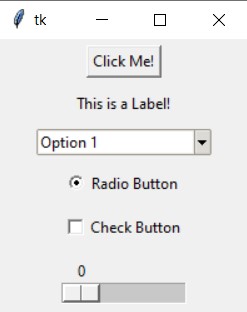
The Default look on windows (vista theme):

The “alt” theme:
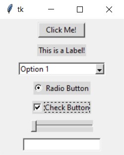
The “clam” theme:
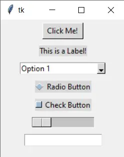
To learn more about ttk Themes, how to create, and modify them, refer to our tutorial on ttk Themes.
List of Default Styles
Every Widget in Tkinter/ttk has a default style, that has a bunch of customizations already applied on it. The below table shows the names of these default styles, which you may or may not want to override to change the default look for widget groups.
| Widget class | Style name |
|---|---|
Button | TButton |
Checkbutton | TCheckbutton |
Combobox | TCombobox |
Entry | TEntry |
Frame | TFrame |
Label | TLabel |
LabelFrame | TLabelFrame |
Menubutton | TMenubutton |
Notebook | TNotebook |
PanedWindow | TPanedwindow |
Progressbar | Horizontal.TProgressbar / Vertical.TProgressbar |
Radiobutton | TRadiobutton |
Scale | Horizontal.TScale / Vertical.TScale |
Scrollbar | Horizontal.TScrollbar / Vertical.TScrollbar |
Separator | TSeparator |
Sizegrip | TSizegrip |
Treeview | Treeview |
This marks the end of the Tkinter ttk Style tutorial. Any suggestions or contributions for CodersLegacy are more than welcome. Questions regarding the tutorial content can be asked in the comments section below.

Thank You
Your Artical Helpfull for me and I learn some new.
Thank You Very Much