
This is an article explaining the use of Scatter Plot in JFreeChart.
The JFreeChart Scatter Plot (a.k.a Scatter Chart or Scatter Graph) uses a Cartesian coordinate like system using two variables (one for the x-axis and one for the y-axis). They are similar (visually) to line graphs, but without line segments joining their points.
The purpose of the Scatter Plot is to observe the relationship between these two variables by plotting dots on to the chart. You can also choose to have multiple collections of data as long as each collection has a different color or shape (to help differentiate).
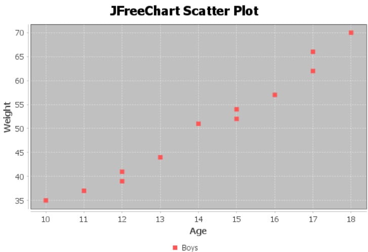
JFreeChart Scatter Plot example
The Scatter plot that we are going to be creating represents the weight of boys in different age groups. Normally there would be alot more data (100+ sets) here to help get a better estimation. However, this is just an example so we’ll have to make do.
The method for creating a scatter plot is a bit different from the rest of the charts in JFreeChart. The dataset object for a Scatter plot is created using the XYSeriesCollection() class.
You must separately create each series for the Scatter plot using the XYSeries class and add data using the add() method. The add method takes two parameters, one value for the X-axis and the second for the Y-axis.
The last two functions have the same syntax as the previous charts. The first creates the scatter plot object, and the second outputs the scatter plot as a PNG file.
import org.jfree.chart.ChartFactory;
import org.jfree.chart.ChartUtils;
import org.jfree.chart.JFreeChart;
import org.jfree.data.xy.XYSeries;
import org.jfree.data.xy.XYSeriesCollection;
import org.jfree.chart.plot.PlotOrientation;
import java.io.File;
import java.io.IOException;

public class Tutorial {

    public static void main(String[] args) throws IOException {

    	XYSeriesCollection dataset = new XYSeriesCollection();

    	XYSeries series1 = new XYSeries("Boys");
        series1.add(10, 35);
        series1.add(11, 37);
        series1.add(12, 41);
        series1.add(12, 39);
        series1.add(13, 44);
        series1.add(14, 51);
        series1.add(15, 52);
        series1.add(15, 54);
        series1.add(16, 57);
        series1.add(17, 62);
        series1.add(17, 66);
        series1.add(18, 70);

        dataset.addSeries(series1);

    	JFreeChart scatterPlot = ChartFactory.createScatterPlot(
    	        "JFreeChart Scatter Plot", // Chart title
    	        "Age", // X-Axis Label
    	        "Weight", // Y-Axis Label
    	        dataset // Dataset for the Chart
    	        );

        ChartUtils.saveChartAsPNG(new File("C://Users/CodersLegacy/Desktop/scatterplot.png"), scatterPlot, 600, 400);
    }
}
The output of the above example code:
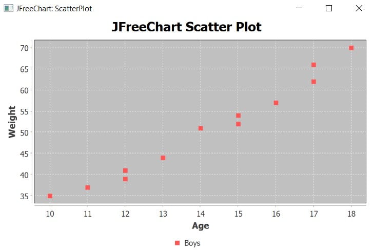
JFreeChart ScatterPlot with JavaFX
If this is your first time using JFreeChart with JavaFX read this setup tutorial to learn how to set both of them up properly.
We use the special ChartViewer class from JFreeChart to convert the scatter plot into an appropriate format for JavaFX to display. By initializing the JavaFX Scene with the chartviewer object and adding it into the Stage, we can display the chart.
import javafx.application.Application;
import javafx.scene.Scene;
import javafx.stage.Stage;
import org.jfree.chart.ChartFactory;
import org.jfree.chart.JFreeChart;
import org.jfree.data.xy.XYSeries;
import org.jfree.data.xy.XYSeriesCollection;
import org.jfree.chart.fx.ChartViewer;

public class Tutorial extends Application{
    public static void main(String[] args) {
        launch(args);
    }

    public static JFreeChart createChart() {

    	XYSeriesCollection dataset = new XYSeriesCollection();

    	XYSeries series1 = new XYSeries("Boys");
        series1.add(10, 35);
        series1.add(11, 37);
        series1.add(12, 41);
        series1.add(12, 39);
        series1.add(13, 44);
        series1.add(14, 51);
        series1.add(15, 52);
        series1.add(15, 54);
        series1.add(16, 57);
        series1.add(17, 62);
        series1.add(17, 66);
        series1.add(18, 70);

        dataset.addSeries(series1);

    	JFreeChart scatterPlot = ChartFactory.createScatterPlot(
    	        "JFreeChart Scatter Plot", // Chart title
    	        "Age", // X-Axis Label
    	        "Weight", // Y-Axis Label
    	        dataset // Dataset for the Chart
    	        );

    	return scatterPlot;
    }

    @Override
    public void start(Stage stage) throws Exception {

        ChartViewer viewer = new ChartViewer(createChart());
        stage.setScene(new Scene(viewer));
        stage.setTitle("JFreeChart: AreaChart");
        stage.setWidth(600);
        stage.setHeight(400);
        stage.show();
    }
}
The GUI output of the above code. Notice the JavaFX window around the JFreeChart Line chart.
This marks the end of the JFreeChart Scatter Plot tutorial. Any suggestions or contributions for CodersLegacy are more than welcome. Questions regarding the article content can be asked in the comments section below.