
A Wireframe is special type of 3D plot in Matplotlib, used for the representation of 3D Data. It helps you visualize what the data looks, through a series of “wires” or “lines”, which can be straight as well as curved.
You can think of a Wireframe Plot as a “skeletal representation” of a Surface Plot. The only difference between the two, is that a Wireframe uses thin wires with gaps, and a Surface Plot uses squares and rectangles to make a complete figure.
Plotting a Wireframe Graph in Matplotlib
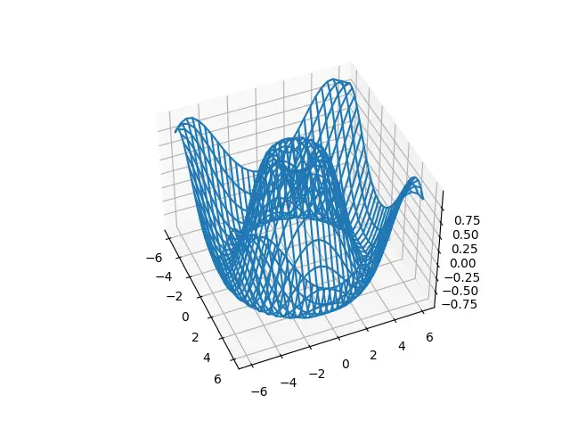
Let’s start off by creating a simple Wireframe plot in matplotlib. In order to create a Wireframe, we use the plot_wireframe() method belonging to an axes object. This function takes three compulsory parameters, X, Y and Z (x-axis, y-axis and z-axis data). For the purpose of this tutorial, we generated some random data.
When creating the axes object using plt.axes(), remember to pass the projection = "3d" argument. This ensures that the resulting figure is made for a 3D plot.
import matplotlib.pyplot as plt
import numpy as np

def f(x, y):
    return np.sin(np.sqrt(x ** 2 + y ** 2))

x = np.linspace(-6, 6, 30)
y = np.linspace(-6, 6, 30)

X, Y = np.meshgrid(x, y)
Z = f(X, Y)

fig = plt.figure()
ax = plt.axes(projection = "3d")

ax.plot_wireframe(X, Y, Z)
plt.show()
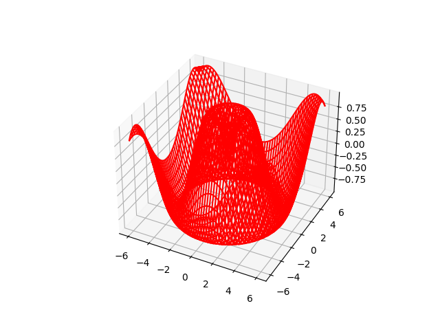
Let’s try and customize our Wireframe plot a bit. For one, let’s the change the color to “Red” from the default “blue”.
Another modification I want to make is to the number of values in our dataset. In the previous example we had 30 values ranging from -6 to 6 (this is what the np.linspace() function does). In this example I have increased the values from 30 to 300.
x = np.linspace(-6, 6, 300)
y = np.linspace(-6, 6, 300)

X, Y = np.meshgrid(x, y)
Z = f(X, Y)

fig = plt.figure()
ax = plt.axes(projection = "3d")

ax.plot_wireframe(X, Y, Z, color = "red")
plt.show()
We can see that the below Wireframe plot is alot more denser than the first one.
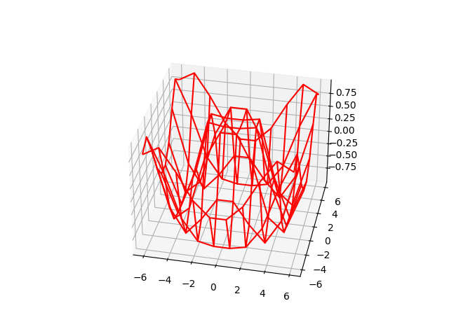
Now let’s try the reverse. We will reduce the number of values to 10.
x = np.linspace(-6, 6, 10)
y = np.linspace(-6, 6, 10)
Here we can see that the “wires” are alot more exposed and there is alot of space between them. This also results in a rather inaccurate representation of our data. The key is to find a balance between too much and too less.
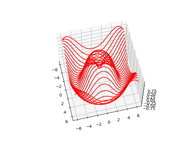
rstride and cstride
Normally a Wireframe plot has wires running in both x and y directions. We can choose to have only one of these displayed by adjusting the rstride and cstride values.
x = np.linspace(-6, 6, 30)
y = np.linspace(-6, 6, 30)

X, Y = np.meshgrid(x, y)
Z = f(X, Y)

fig = plt.figure()
ax = plt.axes(projection = "3d")

ax.plot_wireframe(X, Y, Z, color = "red", rstride = 0)
plt.show()
Try changing the cstride to 0 now, and see what happens!
This marks the end of the 3D Wireframe Plot in Python Matplotlib Tutorial. Any suggestions or contributions for CodersLegacy are more than welcome. Questions regarding the tutorial content can be asked in the comments section below.