
In this tutorial on Python Matplotlib, we will explore how to make Contour Plots in 3D! But first, what is a Contour Plot?
A Contour Plot is a representation of 3D Data on a two-dimensional plane. It removes the “z” axis from the 3D data, and represents the data by taking hollow slices it, and flattening it on the 2D plane (you will understand this better when you see the plots).
The Contour Plot uses a color system to represent the values of the z-axis. For example, slices with a higher z-value might be represented by “Black” and slices with lower value might be colored “Red”.
It may sound rather weird, that we are making a 3D Plot, of a Plot that is a 2D representation of 3D Data. Sounds rather counter intuitive right? But that’s not always the case. At the end of this tutorial, we will show you one actual use of a 3D Contour Plot.
How to make 3D Contour Plots
Let’s start off by making a simple 3D Contour Plot. If you have any experience with two-dimensional Contour plots, then you should already be familiar with 90% of the syntax here. The only difference is that instead of using the contour() function, we need to use contour3D().
def f(x, y):
    return np.sin(x) ** 8 + np.cos(20 + y * x) * np.cos(y)

x = np.linspace(0, 5, 50)
y = np.linspace(0, 5, 50)
X, Y = np.meshgrid(x, y)   # Creates a grid of data, instead of coordinates
Z = f(X, Y)                         # Generates elevation data (z-axis data)
To briefly explain the below code, we first created some data for the x-axis and y-axis using the np.linspace() function (50 values ranging from 0 to 5) and the np.meshgrid() function. In order to get a realistic and interesting pattern, we made up a function from which we will obtain the values of “z” using “x” and “y”.
fig = plt.figure()
ax = plt.axes(projection = "3d")

ax.contour3D(X, Y, Z)
plt.show()
Finally we call the appropriate functions to create and visualize the 3D Contour Plot. Remember to include the projection = '3d' parameter, otherwise it might not create a 3D plot successfully.
Here is the complete code.
from matplotlib import projections
import matplotlib.pyplot as plt
import numpy as np

def f(x, y):
    return np.sin(x) ** 8 + np.cos(20 + y * x) * np.cos(y)

x = np.linspace(0, 5, 50)
y = np.linspace(0, 5, 50)
X, Y = np.meshgrid(x, y)
Z = f(X, Y)

fig = plt.figure()
ax = plt.axes(projection = "3d")

ax.contour3D(X, Y, Z)
plt.show()
The output: (I know it looks rather strange, but hold on for a bit, things will make more sense)
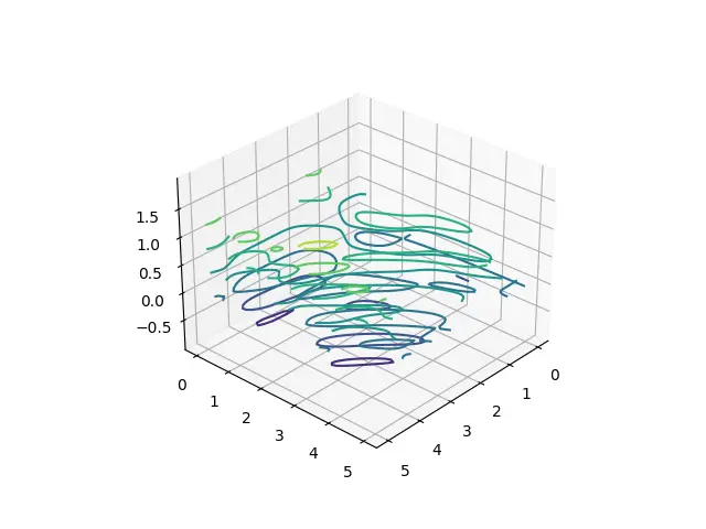
In the above image, if you look carefully you can notice a pattern between the colors. The ones near the bottom are colored purple, and the ones near the top are green.
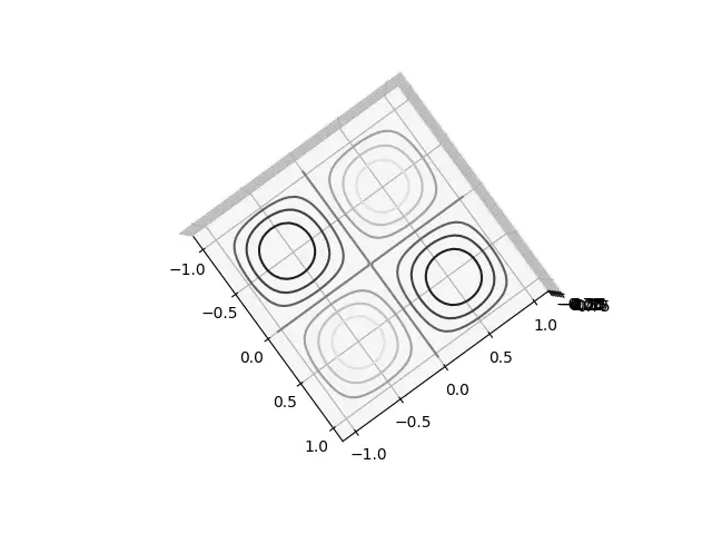
Here is a top down view (you can rotate these models using your mouse! It’s a handy matplotlib feature available in all 3D plots)
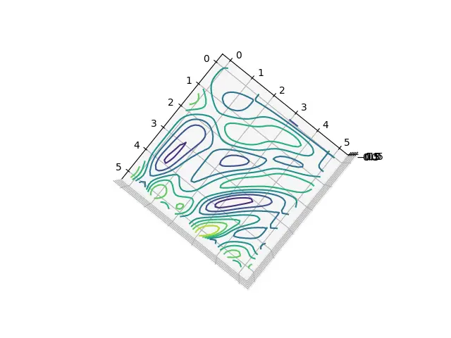
Fun fact, if you make a 2D Contour plot using the same data, then it will look exactly the same as the above image (because the top-down view makes the Z-axis negligible)
Let’s try one more example. We’ll change the data and the function being used, the rest of the syntax remains the same.
from matplotlib import projections
import matplotlib.pyplot as plt
import numpy as np

def f(x, y):
    return np.sin(np.pi*x) * np.sin(np.pi*y)

x = np.linspace(-1, 1, 30)
y = np.linspace(-1, 1, 30)
X, Y = np.meshgrid(x, y)
Z = f(X, Y)

fig = plt.figure()
ax = plt.axes(projection = "3d")

ax.contour3D(X, Y, Z,  cmap='binary')
plt.show()
This graph looks a bit more logical, as it’s based of the Sin and Cos functions. (There are basically 4 individual plots for sin and cos in the below plot, separated by the cross in the middle)
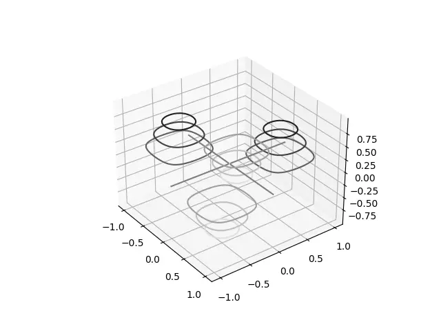
We used a special color map this time, called “binary”. This makes the colors range between white and black depending on the z-value.
Bonus: Try out a few other colormaps yourself! You can look them up online, or try one of these: “autumn_r” and “RdGy“.
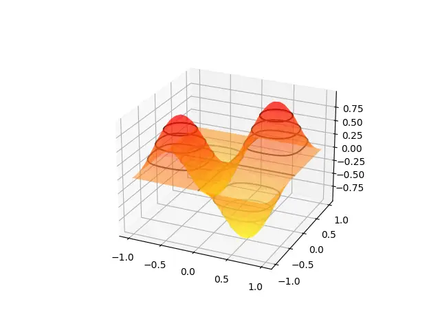
Using Surface Plot with a Contour Plot
Here we will draw both a Surface Plot and a Contour plot on the same graph. You may wonder, why out of all graphs, did we pick the Surface Plot? Well that’s because it best represents the 3D data, and shows how the Contour plot is formed.
from matplotlib import projections
import matplotlib.pyplot as plt
import numpy as np

def f(x, y):
    return np.sin(np.pi*x) * np.sin(np.pi*y)

x = np.linspace(-1, 1, 30)
y = np.linspace(-1, 1, 30)
X, Y = np.meshgrid(x, y)
Z = f(X, Y)

fig = plt.figure()
ax = plt.axes(projection = "3d")

ax.plot_surface(X, Y, Z, cmap="autumn_r", lw=0.5, rstride=1, cstride=1, alpha = 0.5)
ax.contour3D(X, Y, Z, cmap="binary")
plt.show()
Do you see the connection between the Contour Rings and the Surface Plot? Hopefully you now understand exactly how Contour plots work.
If you want to learn more about Surface Plots, refer to the dedicated tutorial for it for a proper walkthrough.
This marks the end of the 3D Contour Plots in Python Matplotlib Tutorial. Any suggestions or contributions for CodersLegacy are more than welcome. Questions regarding the tutorial content can be asked in the comments section below.